JSUI组件容器
1 组件的属性、方法和事件
1.1 组件的属性(Property)
         class属性       id属性          ref属性
          __|__          __|__           __|__
         /     \        /     \         /     \
      属性名  属性值  属性名  属性值   属性名  属性值
        |       |      |       |       |       |
<div class="container" id="container" ref="container">
...
</div>
class属性在css中引用:
.container {
    flex-direction: column;  \
    justify-content: center; |
    align-items: center;     | 样式(Style)
    width: 100%;             |
    height: 100%;            /
}
id属性和ref属性在js中引用:
this.$element("container")...;
this.$refs.container...;
1.2 组件的方法(Method)
.hml:
<marquee id="mq"/>
.js:
this.$element("mq").start();
                       \_____方
                       /     法
this.$element("mq").stop();
1.3 组件的事件(Event)
| 事件 | 描述 |
|---|---|
| touchstart | 开始触摸 |
| touchmove | 触摸移动 |
| touchcancel | 触摸打断 |
| touchend | 触摸终止 |
| click | 点击 |
| longpress | 长按 |
| focus | 获得焦点 |
| blur | 失去焦点 |
| key | 按下智慧屏遥控器的按键 |
响应事件的方法:
.hml:
<button @click="onClick" @key="onKey">
或
<button onclick="onClick" onkey="onKey">
.js:
onClick() {
    // 响应按钮点击
    ...
}
onKey(keyevent) {
    if (keyevent.code == 20) {
        // 响应遥控器下方向键
        ...
    }
}
| 键码 | 按键 |
|---|---|
| 19 | 上方向键 |
| 20 | 下方向键 |
| 21 | 左方向键 |
| 22 | 右方向键 |
| 23 | 确认键 |
| 66 | 回车键 |
| 160 | 小键盘回车键 |
2 常用组件
| 标签 | 名称 |
|---|---|
| text | 文本框 |
| span | 文本行内修饰 |
| marquee | 跑马灯 |
| progress | 进度条 |
| divider | 分隔器 |
| button | 按钮 |
| input | 按钮、单选按钮、复选框、编辑框 |
| label | 标注 |
| textarea | 多行编辑框 |
| search | 搜索编辑框 |
| slider | 滑竿 |
| rating | 评分条 |
| switch | 开关选择器 |
| picker | 滑动选择器 |
| picker-view | 嵌入式滑动选择器 |
| menu | 菜单 |
| select | 下拉选择按钮 |
| option | menu和select的子选项 |
| image | 图像 |
| image-animator | 动画 |
| video | 视频 |
| chart | 图表 |
手机、平板和智慧屏几乎可是使用所有组件,智能穿戴可以使用大部分组件,轻量级智能穿戴只能使用一部分组件。
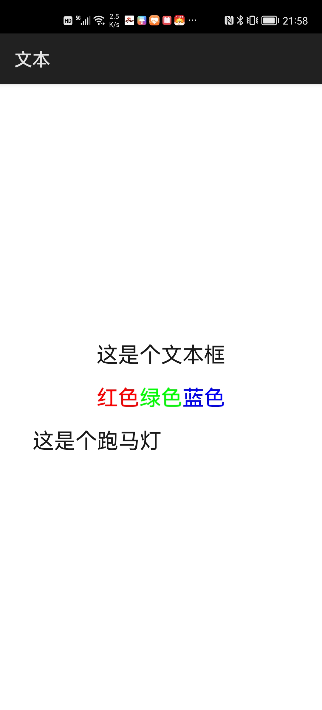
2.1 文本类组件
| 标签 | 名称 |
|---|---|
| text | 文本框 |
| span | 文本行内修饰 |
| marquee | 跑马灯 |
例程:JSText
...\JSText\entry\src\main\js\default\pages\index\index.hml
<div class="div">
    <text class="txt">这是个文本框</text>

    <text class="txt">
        <span class="red">红色</span>
        <span class="green">绿色</span>
        <span class="blue">蓝色</span>
    </text>

    <marquee class="mq" scrollamount="20" loop="-1" direction="right">
        这是个跑马灯
    </marquee>
</div>
...\JSText\entry\src\main\js\default\pages\index\index.css
.div {
    flex-direction: column;
    justify-content: center;
    align-items: center;
}

.txt {
    height: 48px;
    font-size: 24px;
}

.red {
    color: #ff0000;
}

.green {
    color: #00ff00
}

.blue {
    color: #0000ff
}

.mq {
    height: 48px;
    font-size: 24px;
}
运行效果如下图所示:
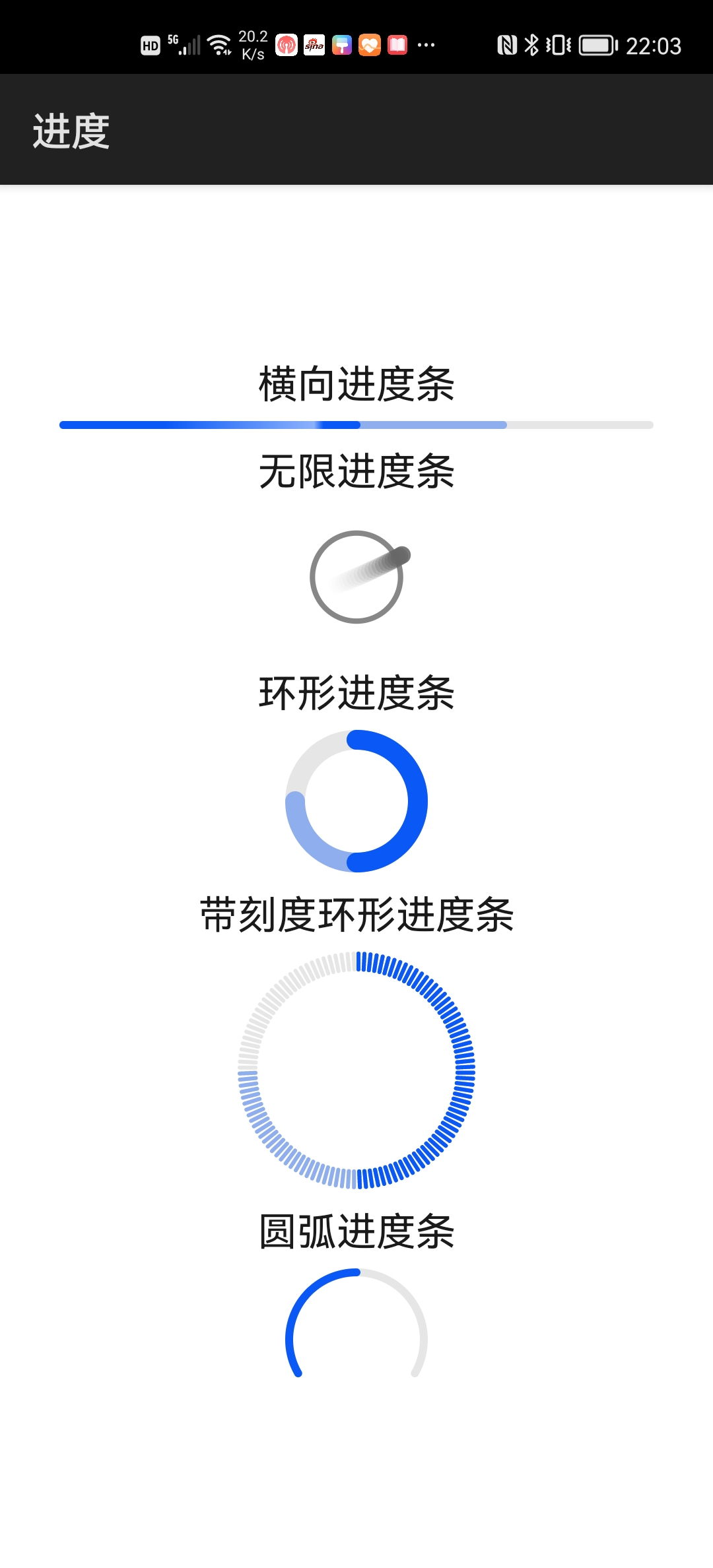
2.2 进度条组件
| 标签 | 名称 |
|---|---|
| progress | 进度条 |
例程:Progress
...\Progress\entry\src\main\js\default\pages\index\index.hml
<div class="div">
    <text class="txt">横向进度条</text>
    <progress type="horizontal" percent="50" secondarypercent="75" />

    <text class="txt">无限进度条</text>
    <progress type="circular" />

    <text class="txt">环形进度条</text>
    <progress type="ring" percent="50" secondarypercent="75" />

    <text class="txt">带刻度环形进度条</text>
    <progress class="prg" type="scale-ring" percent="50"
              secondarypercent="75" />

    <text class="txt">圆弧进度条</text>
    <progress type="arc" percent="50" />
</div>
...\Progress\entry\src\main\js\default\pages\index\index.css
.div {
    flex-direction: column;
    justify-content: center;
    align-items: center
}

.txt {
    height: 40px;
    font-size: 20px;
}

.prg {
    width: 120px;
    height: 120px;
}
运行效果如下图所示:
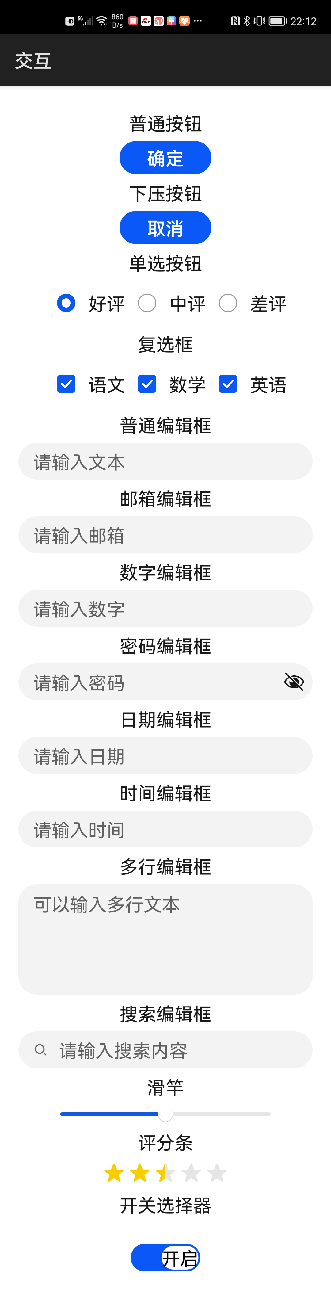
2.3 交互类组件
2.3.1 按钮、编辑框、滑竿、评分条和开关选择器
| 标签 | 名称 |
|---|---|
| button | 按钮 |
| input | 按钮、单选按钮、复选框、编辑框 |
| label | 标注 |
| textarea | 多行编辑框 |
| search | 搜索编辑框 |
| slider | 滑竿 |
| rating | 评分条 |
| switch | 开关选择器 |
例程:Interaction
...\Interaction\entry\src\main\js\default\pages\index\index.hml
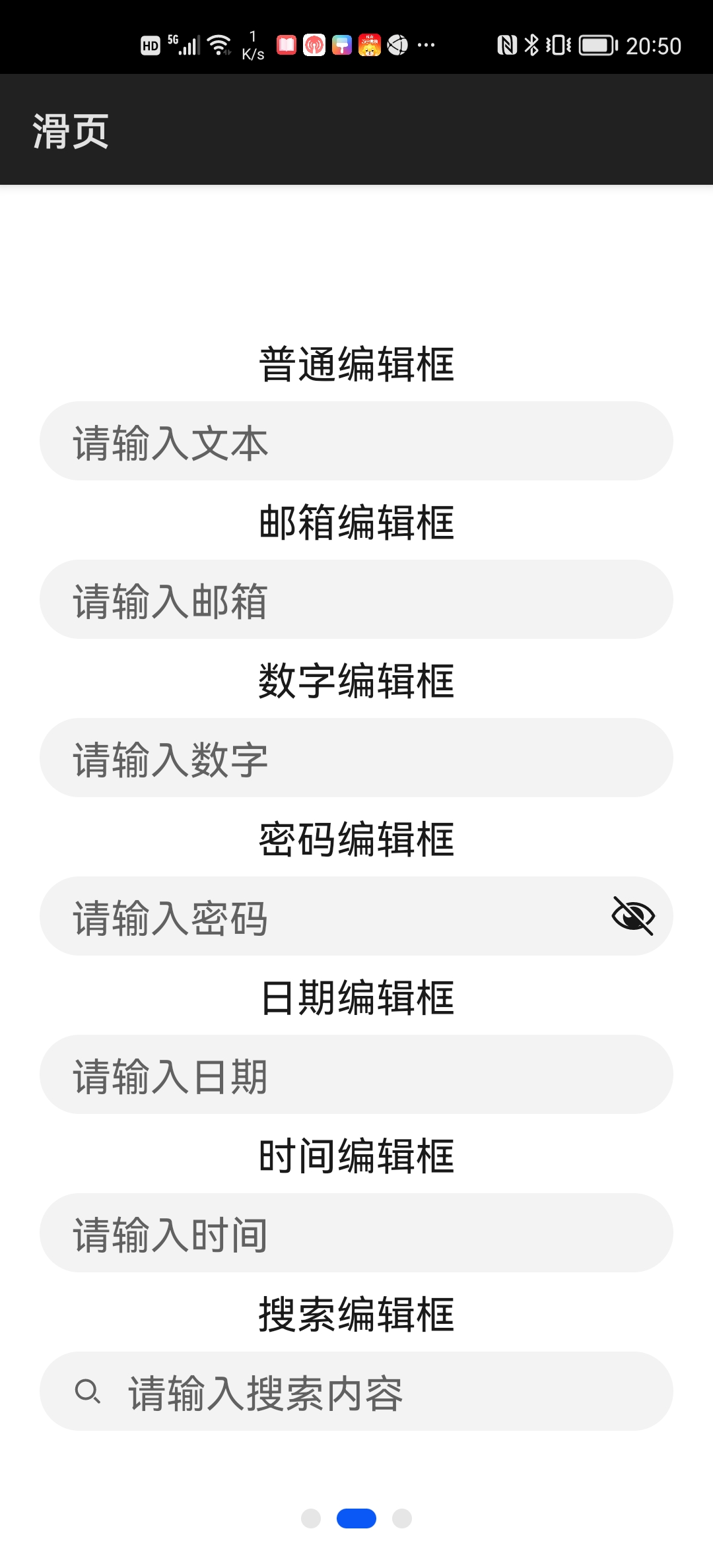
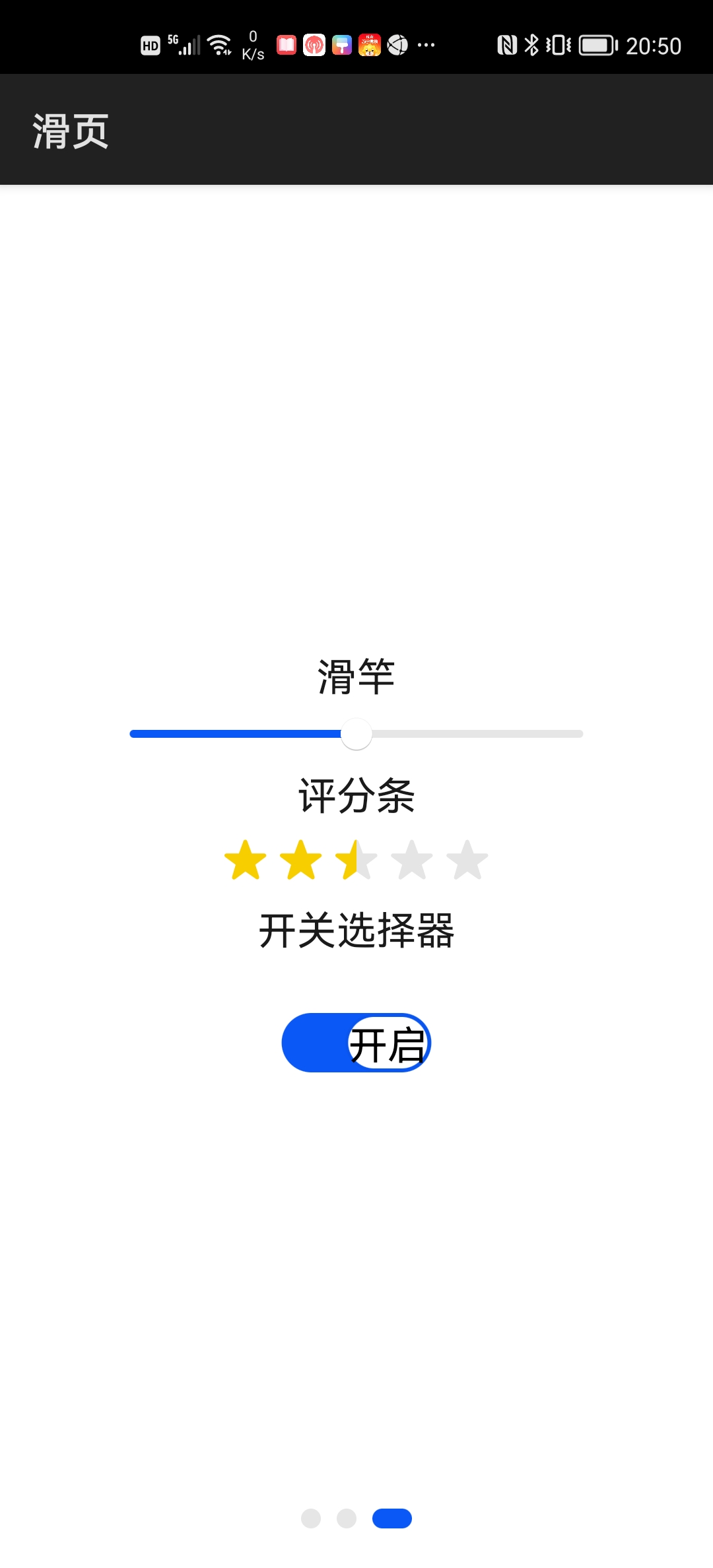
<div class="divColumn">
    <text class="txt">普通按钮</text>
    <button class="btn">确定</button>

    <text class="txt">下压按钮</text>
    <input class="btn" type="button" value="取消" />

    <text class="txt">单选按钮</text>
    <div class="divRow">
        <input type="radio" name="review" id="good" value="1"
               checked="true" />
        <label class="lab" target="good">好评</label>

        <input type="radio" name="review" id="medium" value="2" />
        <label class="lab" target="medium">中评</label>

        <input type="radio" name="review" id="bad" value="3" />
        <label class="lab" target="bad">差评</label>
    </div>

    <text class="txt">复选框</text>
    <div class="divRow">
        <input type="checkbox" id="chinese" checked="true" />
        <label class="lab" target="chinese">语文</label>

        <input type="checkbox" id="math" checked="true" />
        <label class="lab" target="math">数学</label>

        <input type="checkbox" id="english" checked="true" />
        <label class="lab" target="english">英语</label>
    </div>

    <text class="txt">普通编辑框</text>
    <input class="sin" type="text" placeholder="请输入文本" />

    <text class="txt">邮箱编辑框</text>
    <input class="sin" type="email" placeholder="请输入邮箱" />

    <text class="txt">数字编辑框</text>
    <input class="sin" type="number" placeholder="请输入数字" />

    <text class="txt">密码编辑框</text>
    <input class="sin" type="password" placeholder="请输入密码" />

    <text class="txt">日期编辑框</text>
    <input class="sin" type="date" placeholder="请输入日期" />

    <text class="txt">时间编辑框</text>
    <input class="sin" type="time" placeholder="请输入时间" />

    <text class="txt">多行编辑框</text>
    <textarea class="mul" placeholder="可以输入多行文本" />

    <text class="txt">搜索编辑框</text>
    <search class="sin" hint="请输入搜索内容" />

    <text class="txt">滑竿</text>
    <slider min="0" max="1000" value="500" />

    <text class="txt">评分条</text>
    <rating rating="2.5" />

    <text class="txt">开关选择器</text>
    <switch class="swt" texton="开启" textoff="关闭" showtext="true"
            checked="true" />
</div>
...\Interaction\entry\src\main\js\default\pages\index\index.css
.divColumn {
    flex-direction: column;
    justify-content: center;
    align-items: center;
    padding: 20px;
}

.txt {
    height: 40px;
    font-size: 20px;
}

.btn {
    width: 100px;
    height: 36px;
    font-size: 20px;
}

.divRow {
    flex-direction: row;
    justify-content: center;
    align-items: center
}

.lab {
    font-size: 20px;
}

.sin {
    font-size: 20px;
}

.mul {
    height: 120px;
    font-size: 20px;
}

.swt {
    font-size: 20px;
}
运行效果如下图所示:
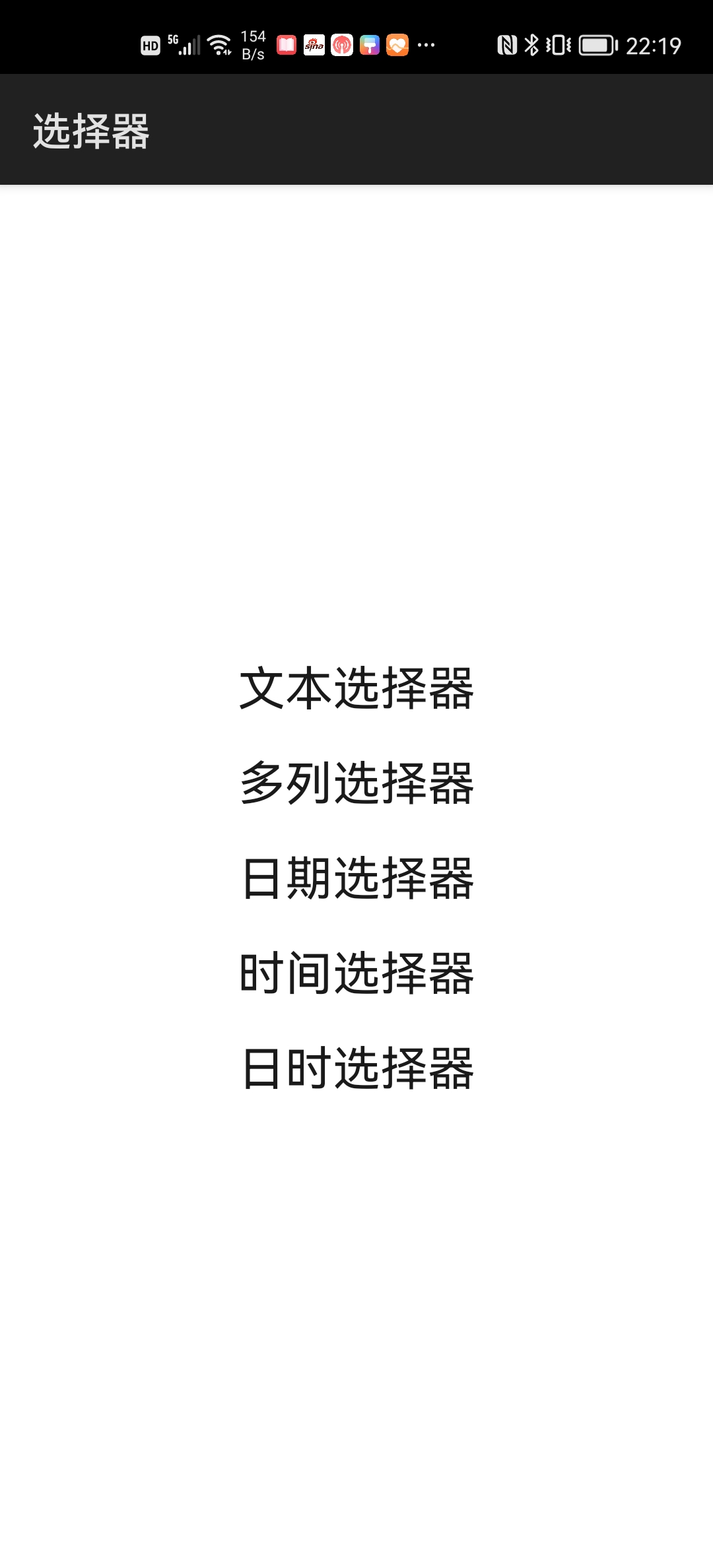
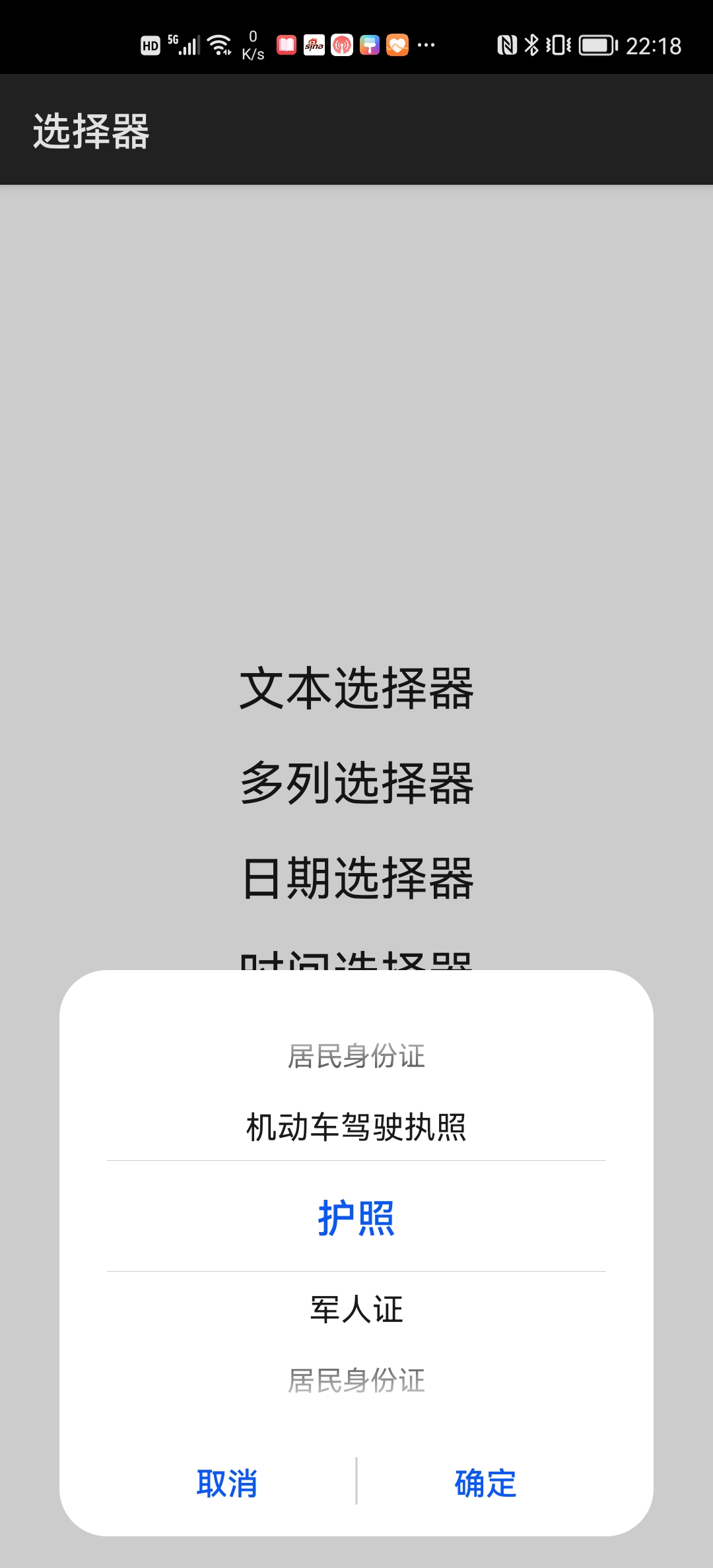
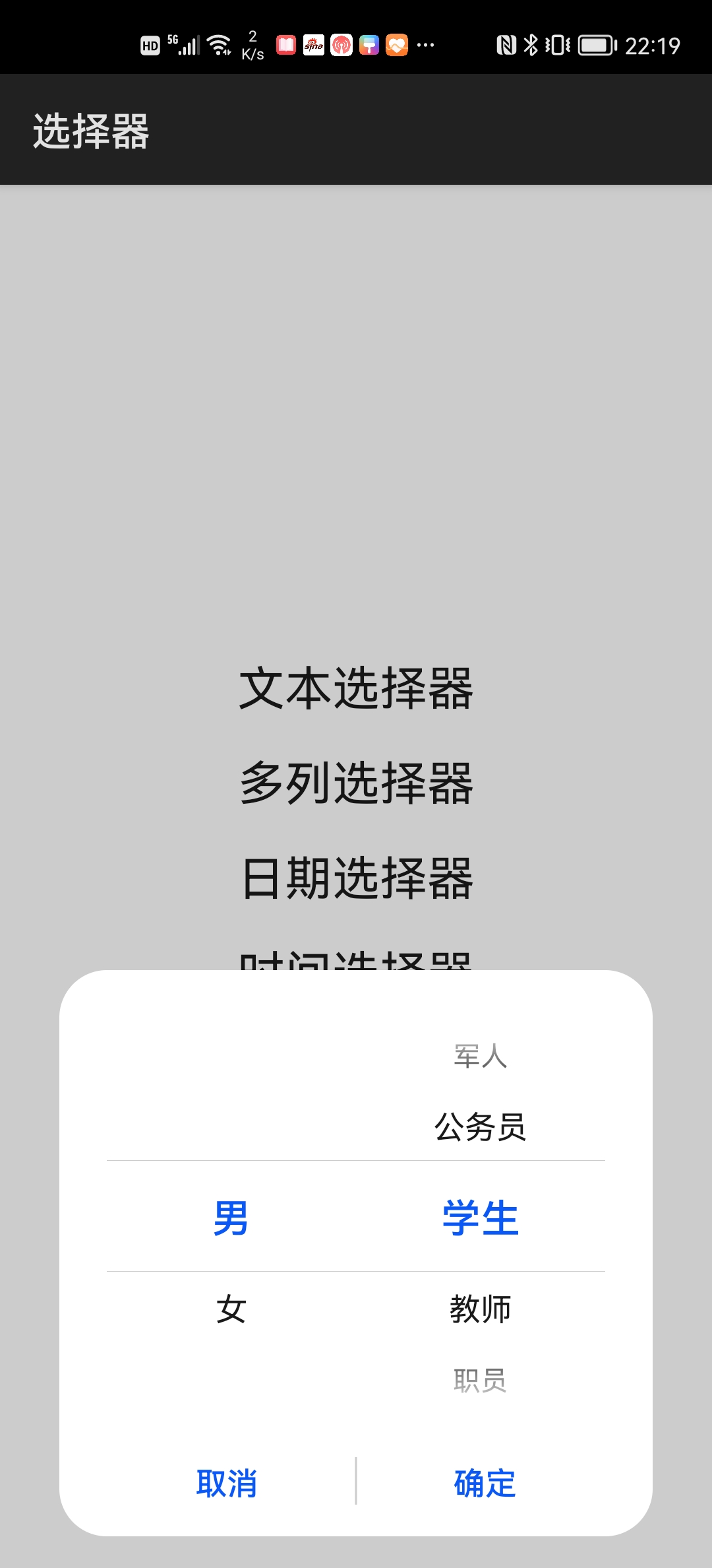
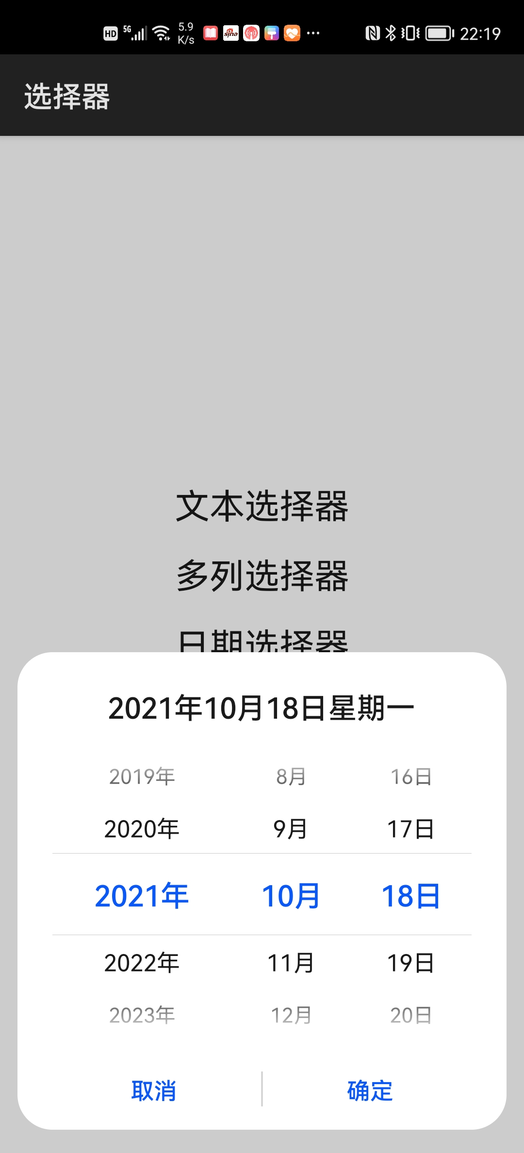
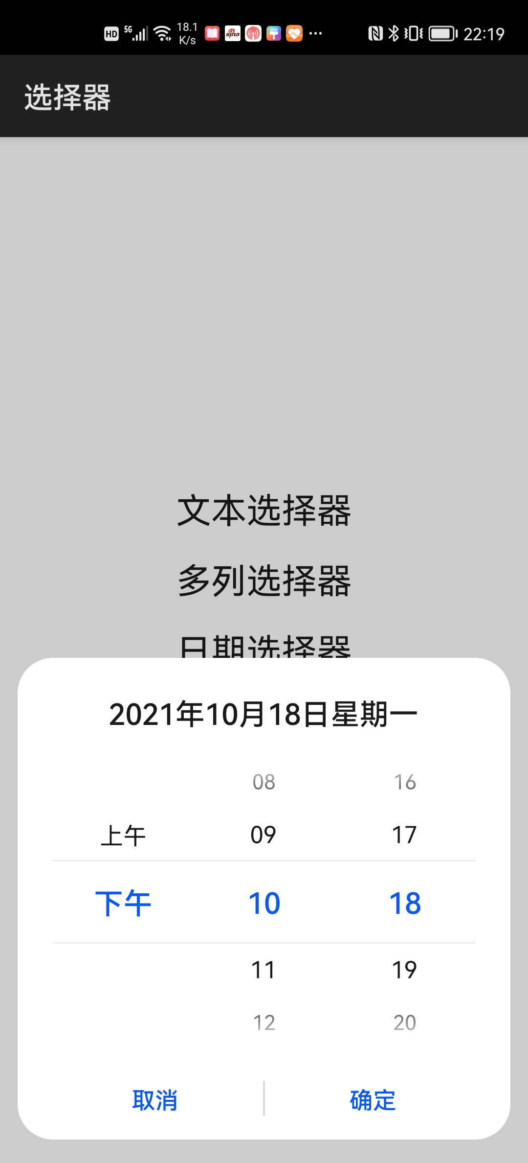
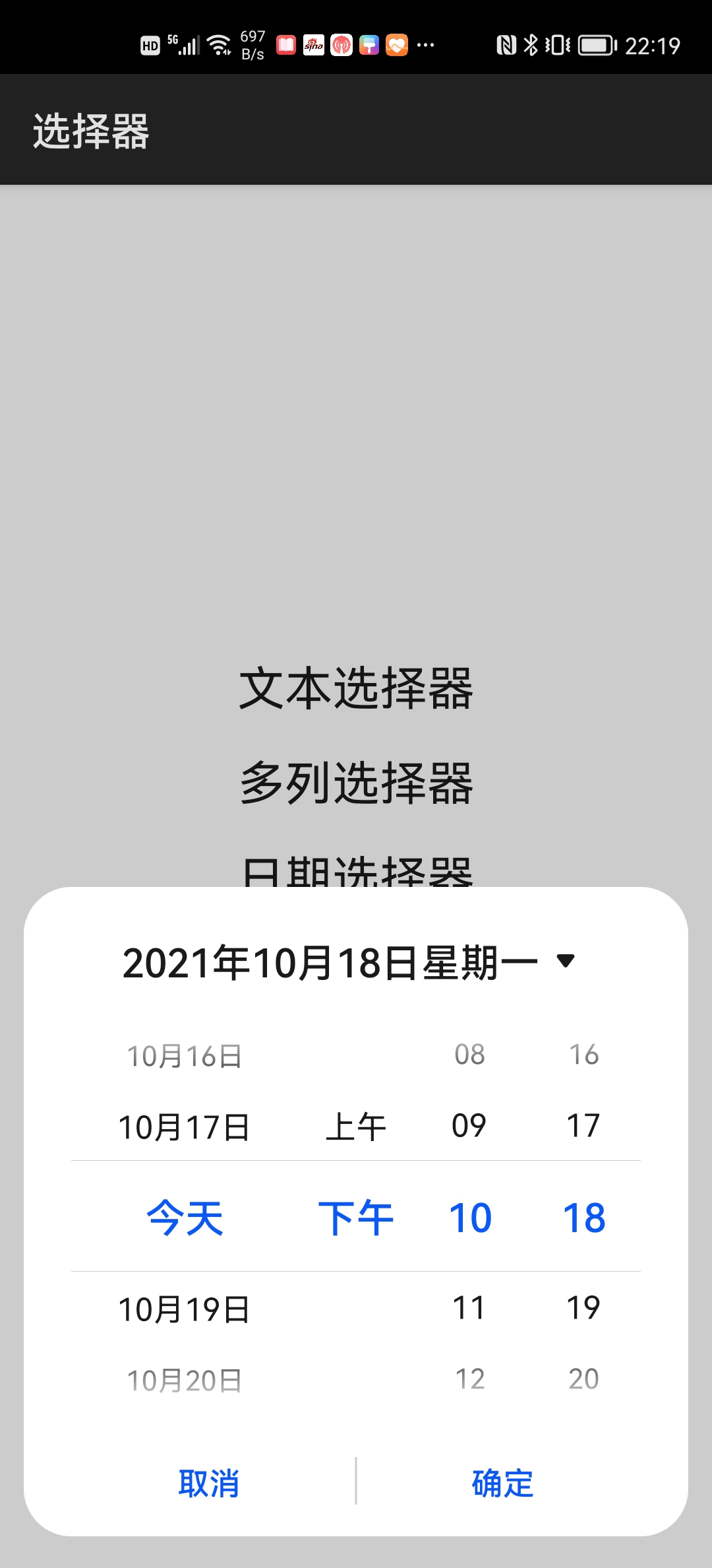
2.3.2 滑动选择器
| 标签 | 名称 |
|---|---|
| picker | 滑动选择器 |
例程:JSPicker
...\JSPicker\entry\src\main\js\default\pages\index\index.hml
<div class="div">
    <picker type="text" class="pck" range="{{text}}">文本选择器</picker>
    <picker type="multi-text" class="pck" range="{{multiText}}">多列选择器</picker>
    <picker type="date" class="pck">日期选择器</picker>
    <picker type="time" class="pck">时间选择器</picker>
    <picker type="datetime" class="pck">日时选择器</picker>
</div>
...\JSPicker\entry\src\main\js\default\pages\index\index.css
.div {
    flex-direction: column;
    justify-content: center;
    align-items: center;
}

.pck {
    height: 48px;
    font-size: 24px;
}
...\JSPicker\entry\src\main\js\default\pages\index\index.js
export default {
    data: {
        text: ["护照", "军人证", "居民身份证", "机动车驾驶执照"],
        multiText: [
            ["男", "女"],
            ["学生", "教师", "职员", "军人", "公务员"]]
    }
}
运行效果如下图所示:
2.3.3 菜单和下拉选择按钮
| 标签 | 名称 |
|---|---|
| menu | 菜单 |
| select | 下拉选择按钮 |
| option | menu和select的子选项 |
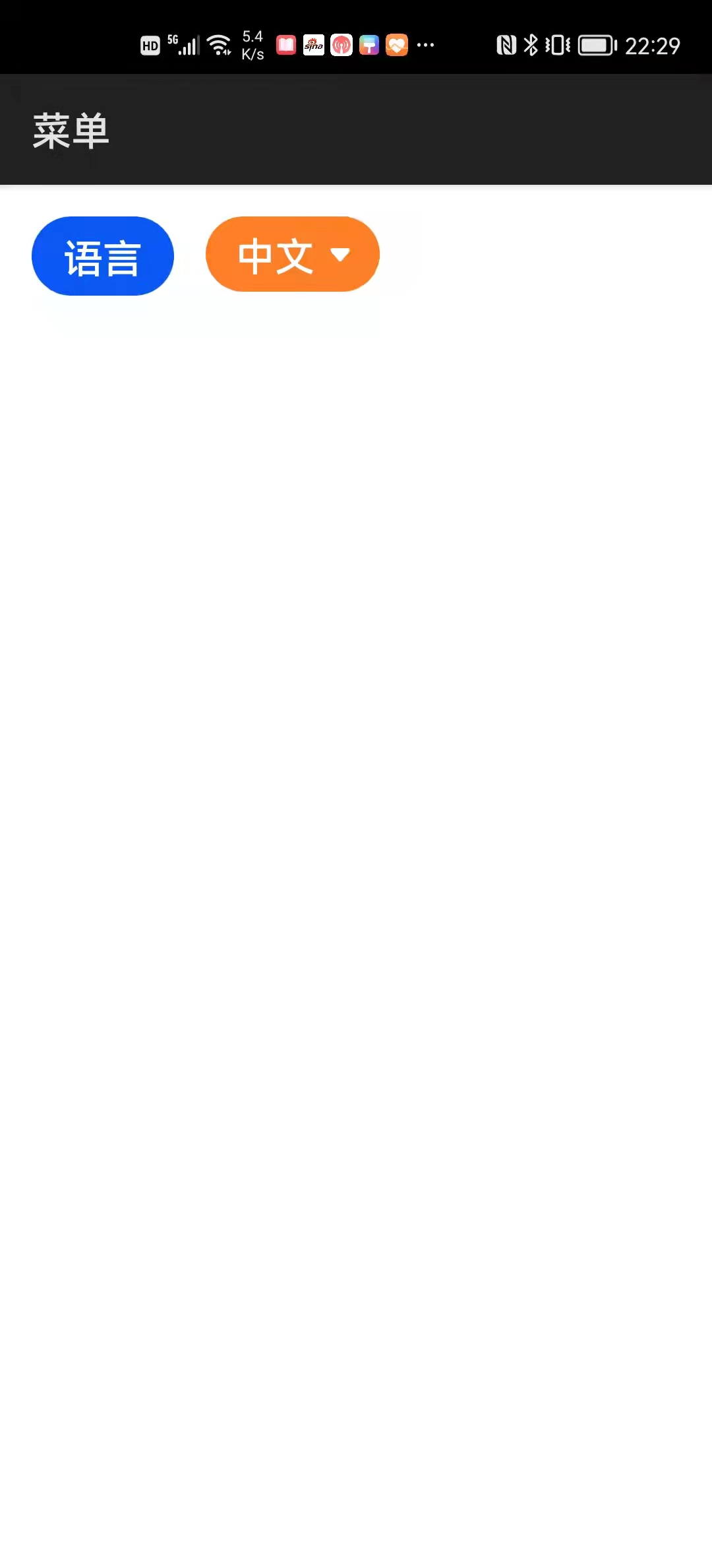
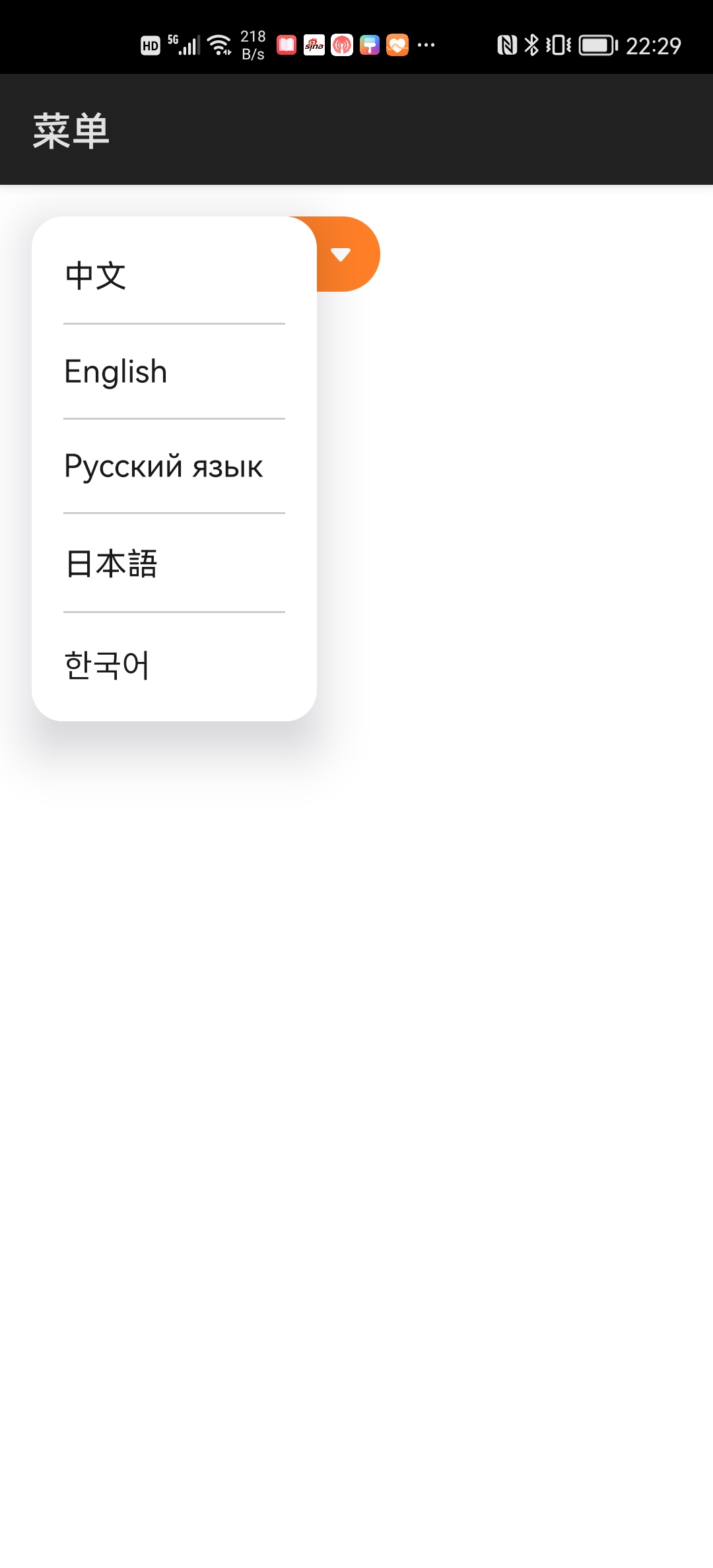
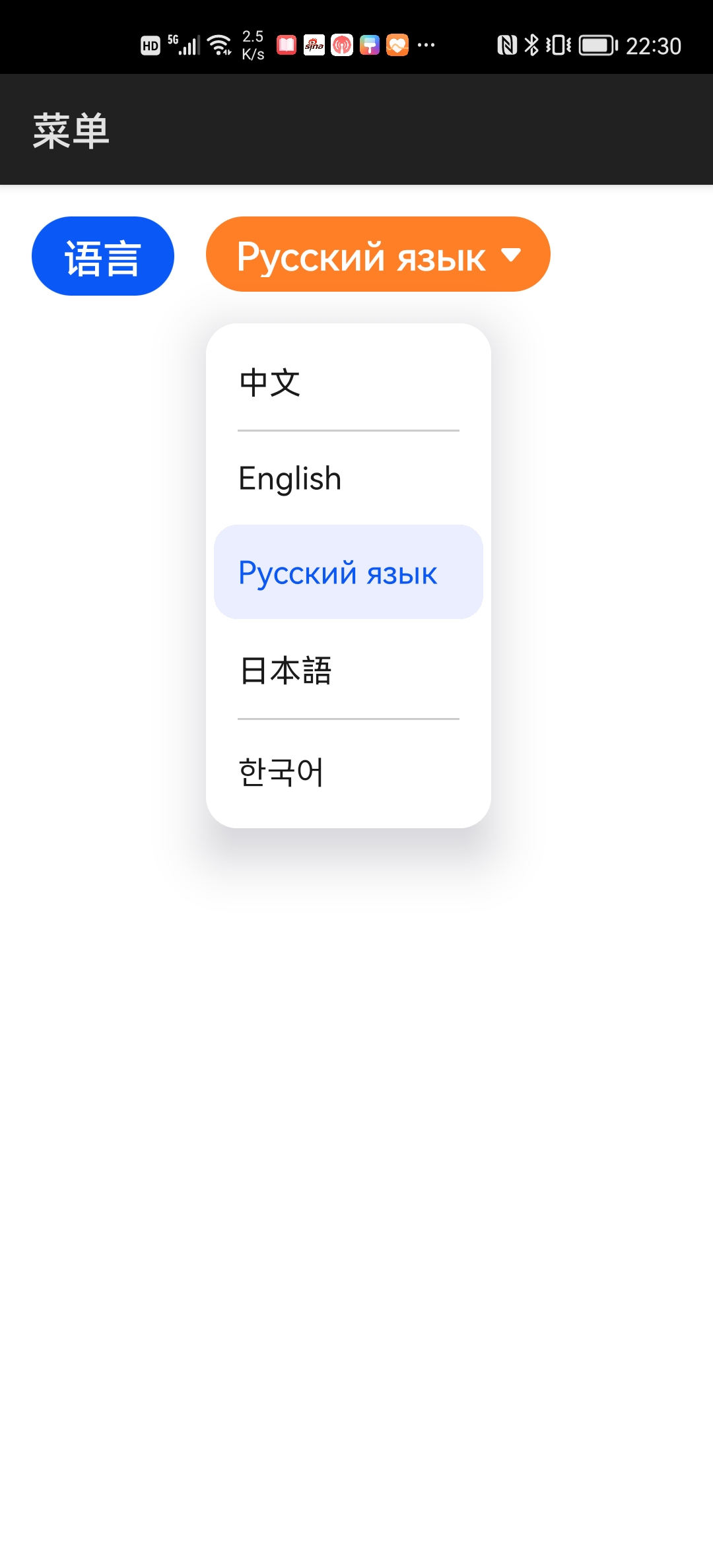
例程:Menu
...\Menu\entry\src\main\js\default\pages\index\index.hml
<div class="div">
    <input type="button" class="btn" value="语言" @click="onClick" />

    <menu id="menu">
        <option value="chinese">中文</option>
        <option value="english">English</option>
        <option value="russian">Русский язык</option>
        <option value="japanese">日本語</option>
        <option value="korean">한국어</option>
    </menu>

    <select class="sel">
        <option value="chinese">中文</option>
        <option value="english">English</option>
        <option value="russian">Русский язык</option>
        <option value="japanese">日本語</option>
        <option value="korean">한국어</option>
    </select>
</div>
...\Menu\entry\src\main\js\default\pages\index\index.css
.div {
    flex-direction: row;
    justify-content: flex-start;
    align-items: flex-start;
    padding: 16px;
}

.btn {
    font-size: 20px;
}

.sel {
    height: 38px;
    padding-left: 15px;
    padding-right: 15px;
    margin-left: 16px;
    font-size: 20px;
    background-color: #ff7f27;
    color: #ffffff;
}
...\Menu\entry\src\main\js\default\pages\index\index.js
export default {
    onClick() {
        this.$element("menu").show();
    }
}
运行效果如下图所示:
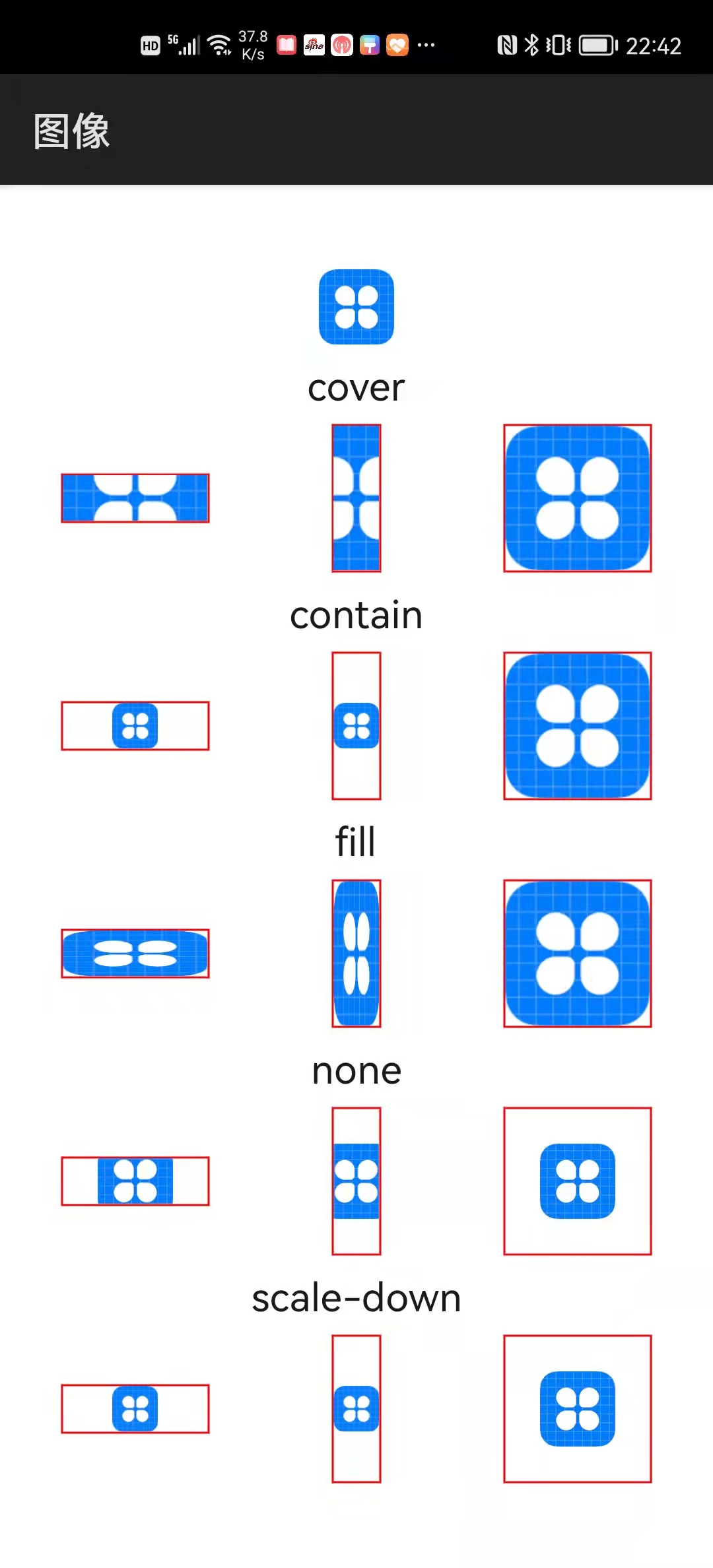
2.3.4 图像
| 标签 | 名称 |
|---|---|
| image | 图像 |
当图像组件和图像大小不一致时,组件的object-fit样式会影响图像的缩放:
| object-fit | 描述 |
|---|---|
| cover | 纵横比不变,缩放填满组件 |
| contain | 纵横比不变,缩放显示全图 |
| fill | 不保证纵横比,缩放填满组件 |
| none | 不缩放,居中裁剪 |
| scale-down | 纵横比不变,只缩不放显示全图 |
例程:JSImage
...\JSImage\entry\src\main\js\default\common\images\icon.png
...\JSImage\entry\src\main\js\default\pages\index\index.hml
<div class="divColumn">
    <image class="imgOriginal" src="/common/images/icon.png" />

    <text class="txt">cover</text>
    <div class="divRow">
        <image class="imgCoverHor" src="/common/images/icon.png" />
        <image class="imgCoverVer" src="/common/images/icon.png" />
        <image class="imgCoverBig" src="/common/images/icon.png" />
    </div>

    <text class="txt">contain</text>
    <div class="divRow">
        <image class="imgContainHor" src="/common/images/icon.png" />
        <image class="imgContainVer" src="/common/images/icon.png" />
        <image class="imgContainBig" src="/common/images/icon.png" />
    </div>

    <text class="txt">fill</text>
    <div class="divRow">
        <image class="imgFillHor" src="/common/images/icon.png" />
        <image class="imgFillVer" src="/common/images/icon.png" />
        <image class="imgFillBig" src="/common/images/icon.png" />
    </div>

    <text class="txt">none</text>
    <div class="divRow">
        <image class="imgNoneHor" src="/common/images/icon.png" />
        <image class="imgNoneVer" src="/common/images/icon.png" />
        <image class="imgNoneBig" src="/common/images/icon.png" />
    </div>

    <text class="txt">scale-down</text>
    <div class="divRow">
        <image class="imgScaleDownHor" src="/common/images/icon.png" />
        <image class="imgScaleDownVer" src="/common/images/icon.png" />
        <image class="imgScaleDownBig" src="/common/images/icon.png" />
    </div>
</div>
...\JSImage\entry\src\main\js\default\pages\index\index.css
.divColumn {
    flex-direction: column;
    justify-content: center;
    align-items: center;
}

.txt {
    height: 40px;
    font-size: 20px;
}

.divRow {
    flex-direction: row;
    justify-content: space-around;
    align-items: center;
}

.imgOriginal {
    width: 38px;
    height: 38px;
    object-fit: none;
}

.imgCoverHor {
    width: 75px;
    height: 25px;
    border: 1px;
    border-color: #ff0000;
    object-fit: cover;
}

.imgCoverVer {
    width: 25px;
    height: 75px;
    border: 1px;
    border-color: #ff0000;
    object-fit: cover;
}

.imgCoverBig {
    width: 75px;
    height: 75px;
    border: 1px;
    border-color: #ff0000;
    object-fit: cover;
}

.imgContainHor {
    width: 75px;
    height: 25px;
    border: 1px;
    border-color: #ff0000;
    object-fit: contain;
}

.imgContainVer {
    width: 25px;
    height: 75px;
    border: 1px;
    border-color: #ff0000;
    object-fit: contain;
}

.imgContainBig {
    width: 75px;
    height: 75px;
    border: 1px;
    border-color: #ff0000;
    object-fit: contain;
}

.imgFillHor {
    width: 75px;
    height: 25px;
    border: 1px;
    border-color: #ff0000;
    object-fit: fill;
}

.imgFillVer {
    width: 25px;
    height: 75px;
    border: 1px;
    border-color: #ff0000;
    object-fit: fill;
}

.imgFillBig {
    width: 75px;
    height: 75px;
    border: 1px;
    border-color: #ff0000;
    object-fit: fill;
}

.imgNoneHor {
    width: 75px;
    height: 25px;
    border: 1px;
    border-color: #ff0000;
    object-fit: none;
}

.imgNoneVer {
    width: 25px;
    height: 75px;
    border: 1px;
    border-color: #ff0000;
    object-fit: none;
}

.imgNoneBig {
    width: 75px;
    height: 75px;
    border: 1px;
    border-color: #ff0000;
    object-fit: none;
}

.imgScaleDownHor {
    width: 75px;
    height: 25px;
    border: 1px;
    border-color: #ff0000;
    object-fit: scale-down;
}

.imgScaleDownVer {
    width: 25px;
    height: 75px;
    border: 1px;
    border-color: #ff0000;
    object-fit: scale-down;
}

.imgScaleDownBig {
    width: 75px;
    height: 75px;
    border: 1px;
    border-color: #ff0000;
    object-fit: scale-down;
}
运行效果如下图所示:
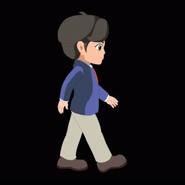
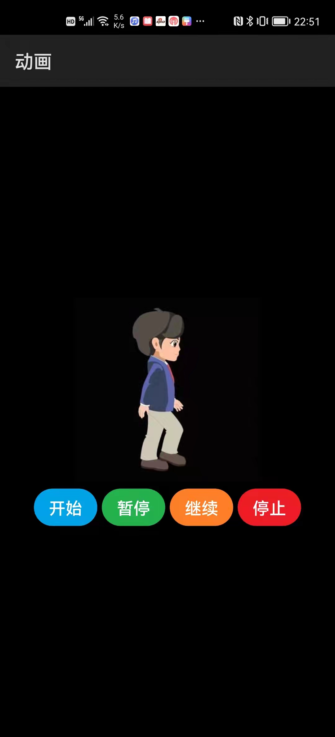
2.3.5 动画
| 标签 | 名称 |
|---|---|
| image-animator | 动画 |
例程:Animator
...\Animator\entry\src\main\js\default\common\images\frame_01.png ~ frame_04.png


...\Animator\entry\src\main\js\default\pages\index\index.hml
<div class="divColumn">
    <image-animator class="ani" ref="ani" images="{{frames}}" duration="660ms" />

    <div class="divRow">
        <input type="button" class="btnStart" value="开始" @click="onStart"/>
        <input type="button" class="btnPause" value="暂停" @click="onPause"/>
        <input type="button" class="btnResume" value="继续" @click="onResume"/>
        <input type="button" class="btnStop" value="停止" @click="onStop"/>
    </div>
</div>
...\Animator\entry\src\main\js\default\pages\index\index.css
.divColumn {
    flex-direction: column;
    justify-content: center;
    align-items: center;
    background-color: #000000;
}

.ani {
    width: 200px;
    height: 200px;
}

.divRow {
    flex-direction: row;
    justify-content: center;
    margin-top: 5px;
}

.btnStart {
    font-size: 18px;
    background-color: #00a2e8;
}

.btnPause {
    margin-left: 5px;
    font-size: 18px;
    background-color: #22b14c;
}

.btnResume {
    margin-left: 5px;
    font-size: 18px;
    background-color: #ff7f27;
}

.btnStop {
    margin-left: 5px;
    font-size: 18px;
    background-color: #ee1c24;
}
...\Animator\entry\src\main\js\default\pages\index\index.js
export default {
    data: {
        frames: [
            {src: "/common/images/frame_01.png"},
            {src: "/common/images/frame_02.png"},
            {src: "/common/images/frame_03.png"},
            {src: "/common/images/frame_04.png"}]
    },
    onStart() {
        this.$refs.ani.start();
    },
    onPause() {
        this.$refs.ani.pause();
    },
    onResume() {
        this.$refs.ani.resume();
    },
    onStop() {
        this.$refs.ani.stop();
    }
}
运行效果如下图所示:
2.3.6 视频
| 标签 | 名称 |
|---|---|
| video | 视频 |
例程:Video
...\Video\entry\src\main\js\default\common\videos\May It Be.mp4

...\Video\entry\src\main\js\default\pages\index\index.hml
<div class="div">
    <video class="vid" src="/common/videos/May It Be.mp4" />
</div>
...\Video\entry\src\main\js\default\pages\index\index.css
.div {
    flex-direction: column;
    justify-content: center;
    align-items: center;
    background-color: #000000;
}

.vid {
    width: 340px;
    height: 255px;
}
运行效果如下图所示:

3 常用容器
3.1 基础容器(div)
div容器的display样式定义了三种布局类型:
| display | 描述 |
|---|---|
| flex | 弹性布局,默认 |
| grid | 网格布局 |
| none | 空布局,隐藏容器及其中的所有组件 |
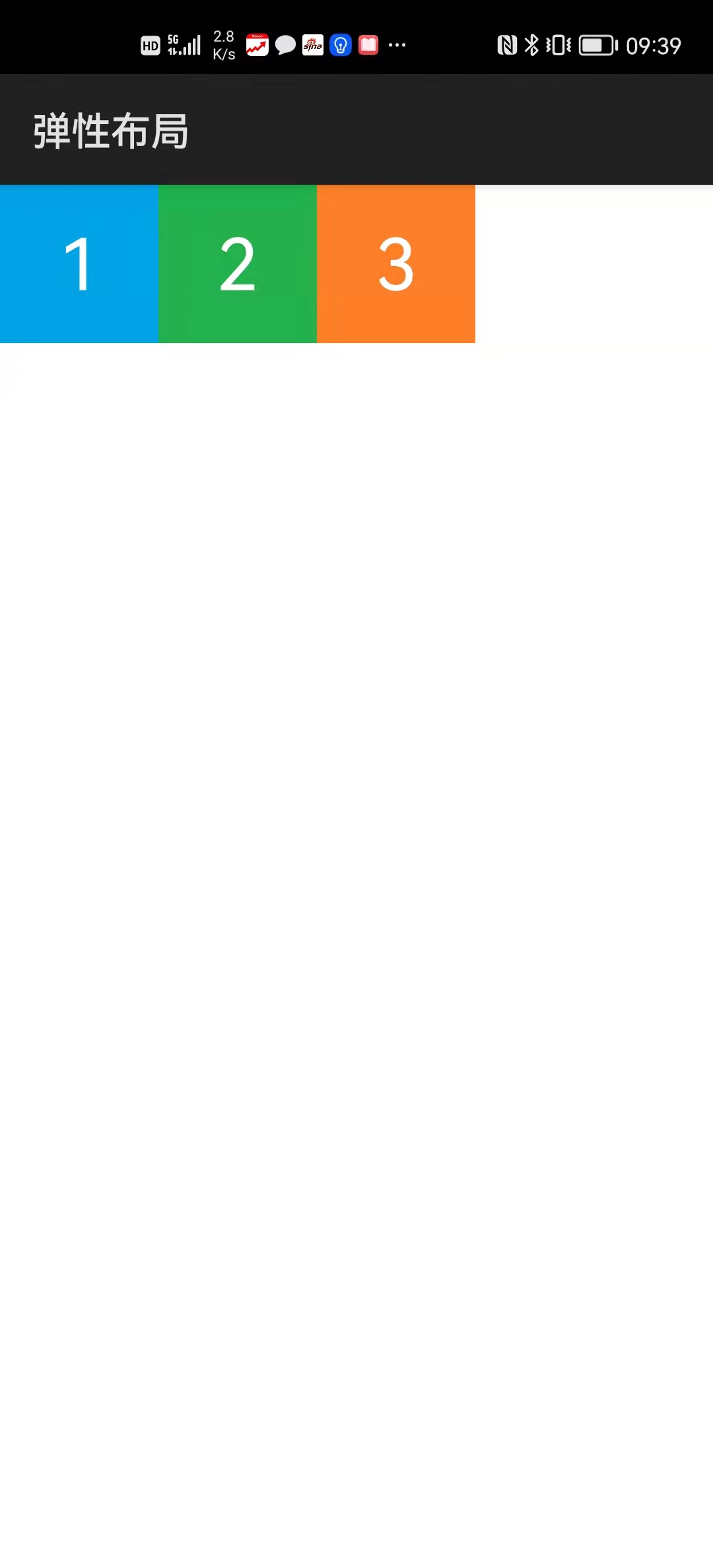
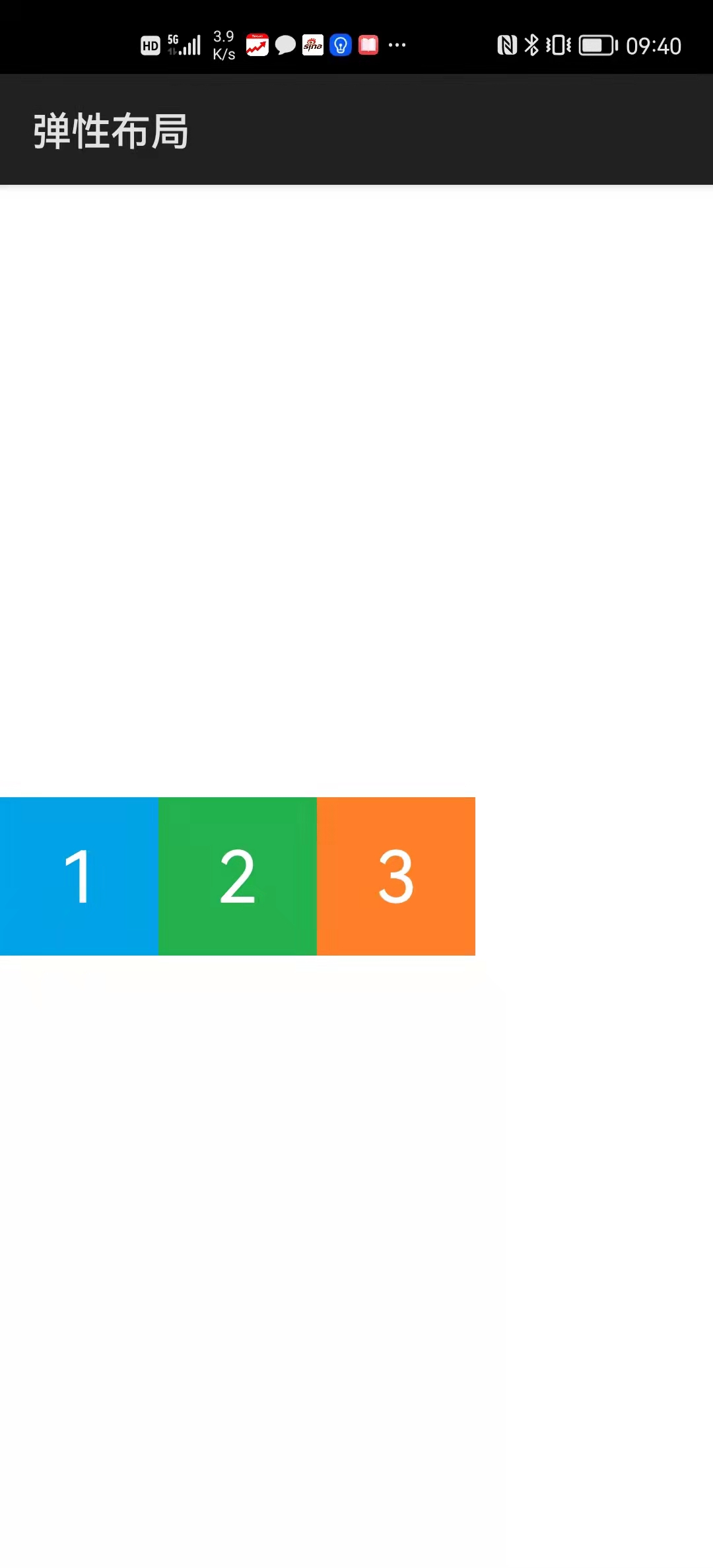
3.1.1 弹性布局(flex)
弹性布局是沿着水平(行)或者垂直(列)方向依次排列其中组件的布局。组件的排列方向称为主轴方向或主方向。与主轴垂直的方向称为副轴方向或副方向。
div容器的flex-direction样式定义了弹性布局的主方向:
| flex-direction | 描述 |
|---|---|
| row | 水平排列,默认 |
| column | 垂直排列 |
flex-direction: row

  _____主轴
 |
 |1 2 3
 |
副
轴
flex-direction: column

  _____副轴
 |  1
 |  2
 |  3
主
轴
div容器的flex-wrap样式定义了当主方向不足以容纳所有组件时是否换行或者换列:
| flex-wrap | 描述 |
|---|---|
| nowrap | 不换行(列),默认 |
| wrap | 换行(列) |
flex-direction: row
flex-wrap: nowrap

  _____主轴
 |
 |1 2 3 4 5
 |
副
轴

flex-direction: column
flex-wrap: nowrap

  _____副轴
 |  1
 |  2
 |  3
主  4
轴  5
flex-direction: row
flex-wrap: wrap

  _____主轴
 |1 2 3
 |
 |4 5
副
轴

flex-direction: column
flex-wrap: wrap

  _____副轴
 | 1 4
 | 2 5
 | 3
主
轴
div容器的justify-content样式定义了容器中组件在主方向上的对齐方式:
| justify-content | 描述 | 示意 |
|---|---|---|
| flex-start | 靠左(上),默认 | [123 ] |
| center | 居中 | [ 123 ] |
| flex-end | 靠右(下) | [ 123] |
| space-between | 等间距,两端顶头 | [1 2 3] |
| space-around | 等间距,两端留白 | [ 1 2 3 ] |
div容器的align-items样式定义了容器中组件在副方向上的对齐方式:
| align-items | 描述 |
|---|---|
| flex-start | 靠上(左),默认 |
| center | 居中 |
| flex-end | 靠下(右) |
| stretch | 拉伸至充满容器 |
当div容器的flex-wrap样式为wrap时,其align-content样式定义了多行(列)的对齐方式,取值和含义与justify-content样式类似。
例程:Flex
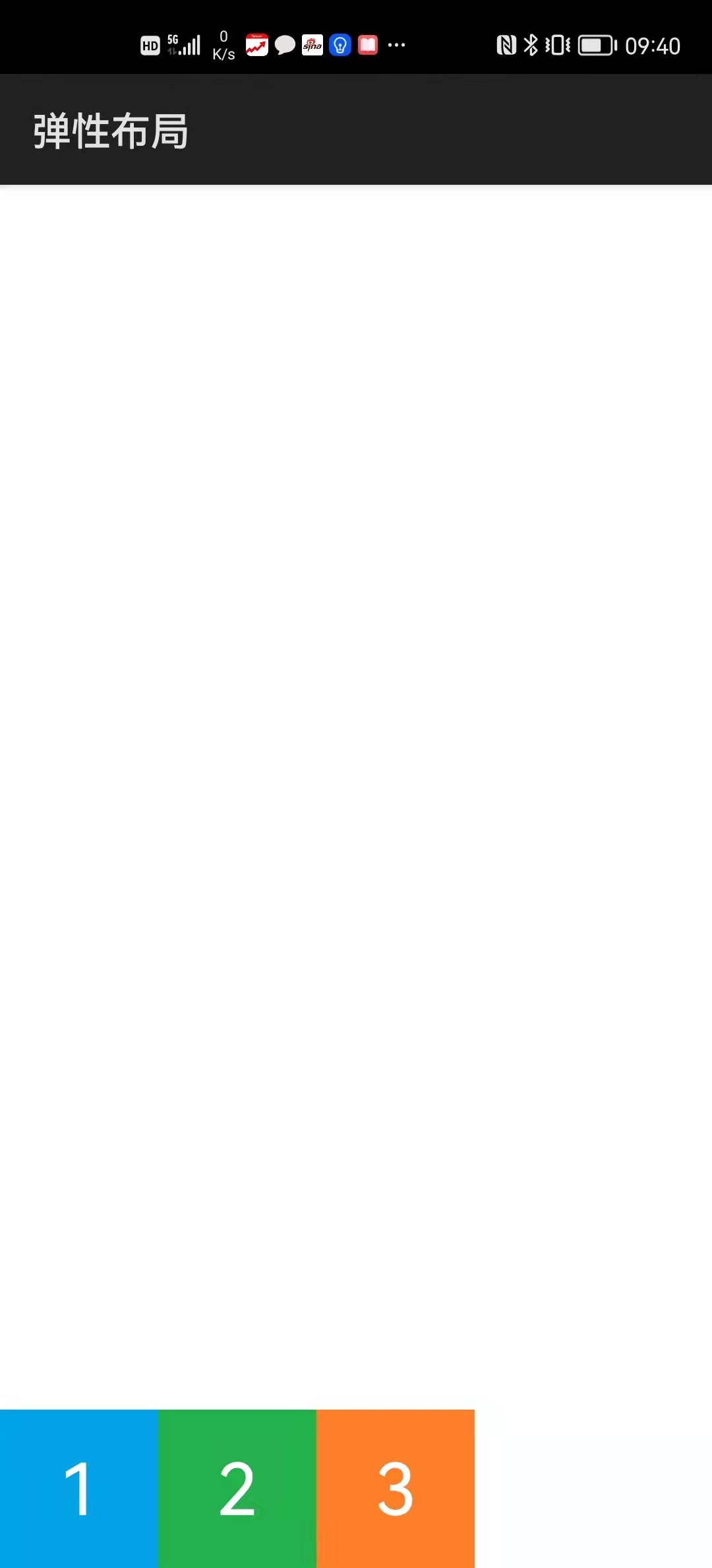
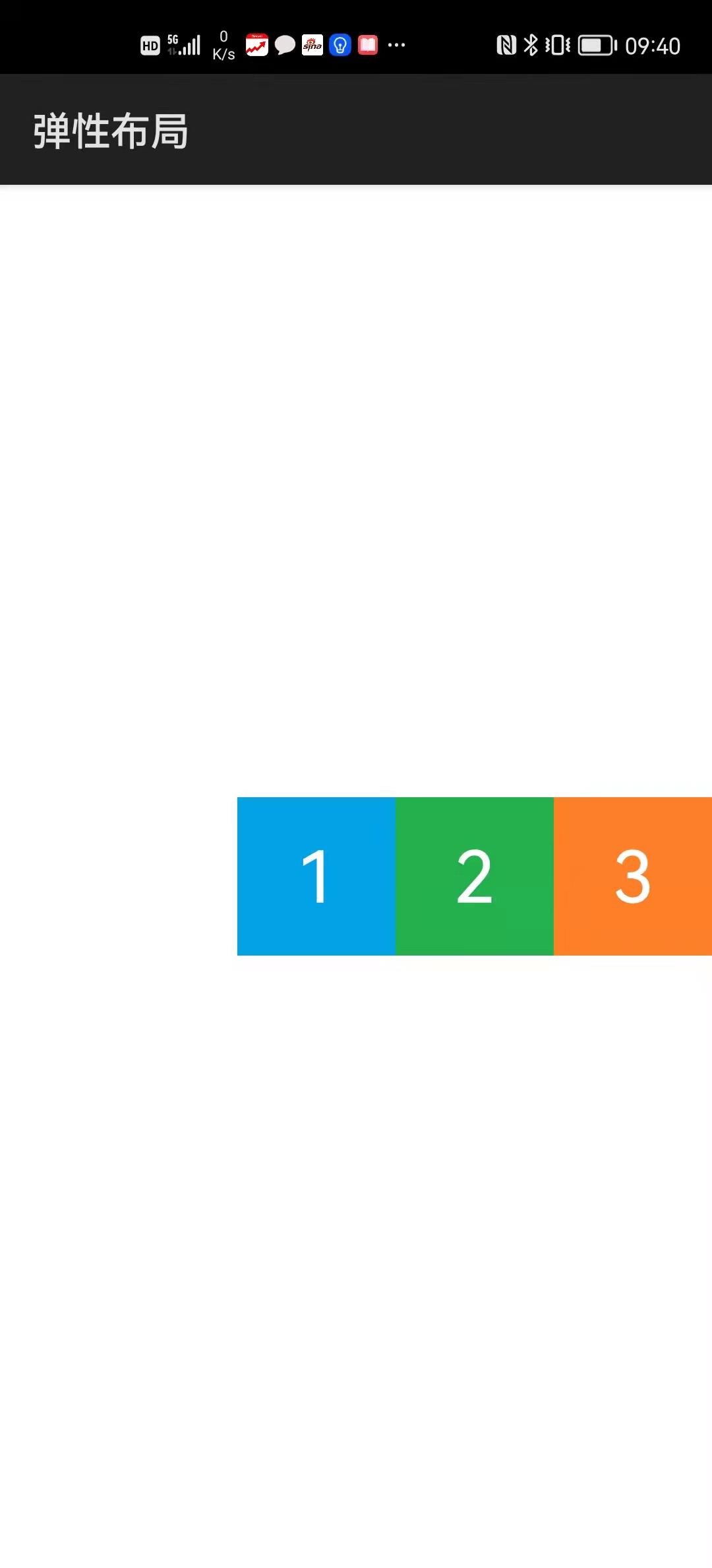
...\Flex\entry\src\main\js\default\pages\index\index.hml
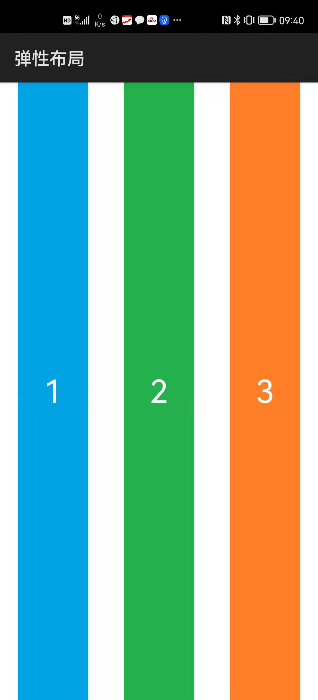
<div class="div" @swipe="onSwipe">
    <text class="txt1">1</text>
    <text class="txt2">2</text>
    <text class="txt3">3</text>
</div>
...\Flex\entry\src\main\js\default\pages\index\index.css
.div {
    display: flex;
    flex-direction: row;
    justify-content: flex-start;
    align-items: flex-start;
}

.txt1 {
    width: 80px;
    height: 80px;
    font-size: 36px;
    text-align: center;
    background-color: #00a2e8;
    color: #ffffff;
}

.txt2 {
    width: 80px;
    height: 80px;
    font-size: 36px;
    text-align: center;
    background-color: #22b14c;
    color: #ffffff;
}

.txt3 {
    width: 80px;
    height: 80px;
    font-size: 36px;
    text-align: center;
    background-color: #ff7f27;
    color: #ffffff;
}
...\Flex\entry\src\main\js\default\pages\index\index.js
import router from '@system.router';

export default {
    onSwipe(e) {
        if (e.direction == "left")
            router.push({uri: "pages/start_center/start_center"});
    }
}
运行效果如下图所示:
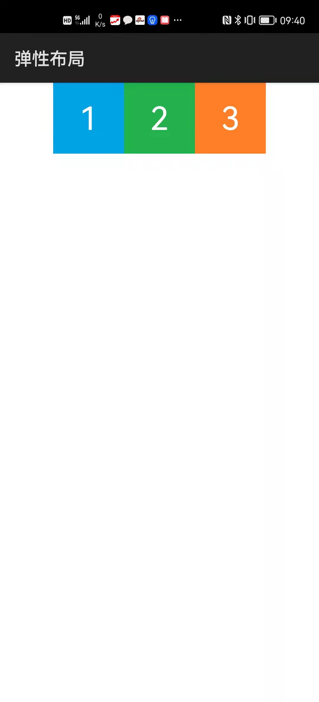
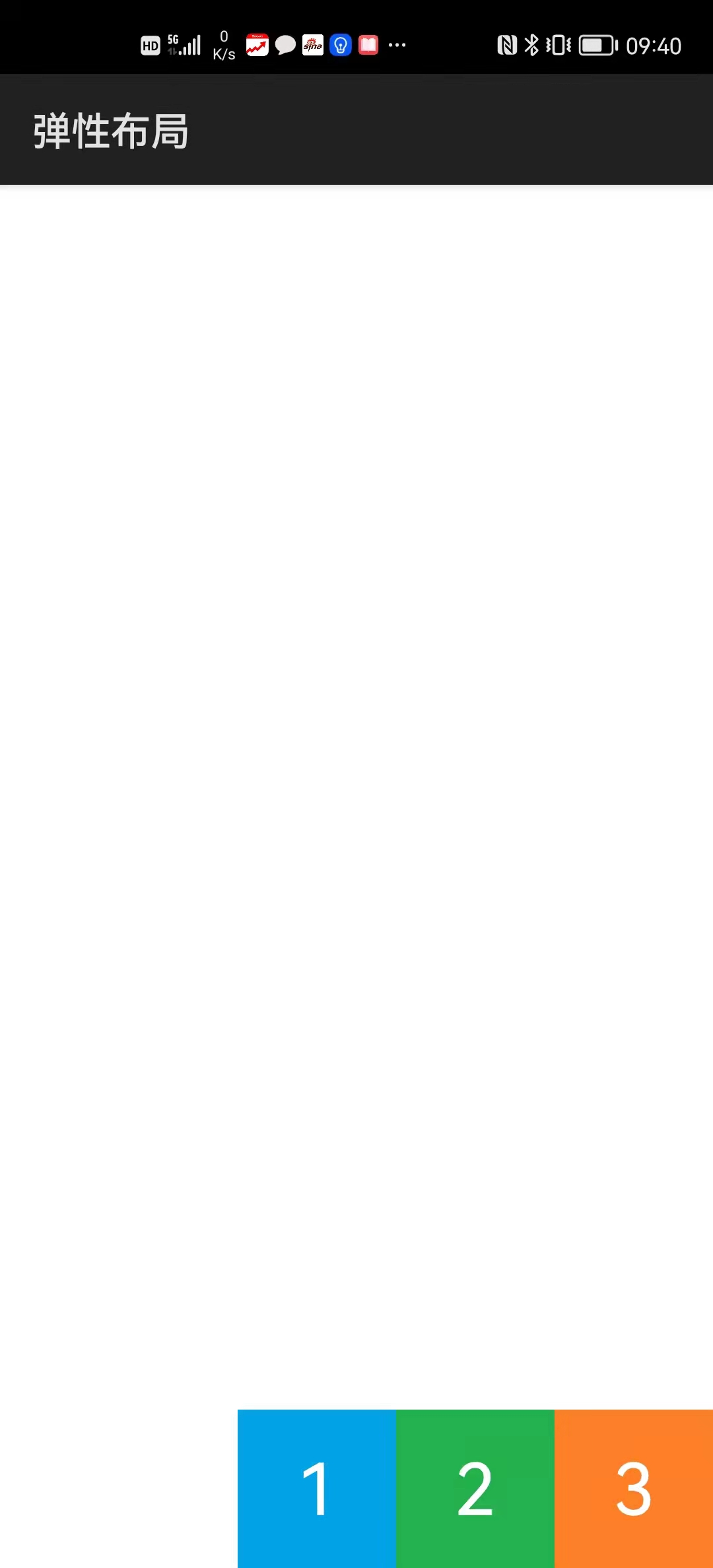
...\Flex\entry\src\main\js\default\pages\start_center\start_center.hml
<div class="div" @swipe="onSwipe">
    <text class="txt1">1</text>
    <text class="txt2">2</text>
    <text class="txt3">3</text>
</div>
...\Flex\entry\src\main\js\default\pages\start_center\start_center.css
.div {
    display: flex;
    flex-direction: row;
    justify-content: flex-start;
    align-items: center;
}

.txt1 {
    width: 80px;
    height: 80px;
    font-size: 36px;
    text-align: center;
    background-color: #00a2e8;
    color: #ffffff;
}

.txt2 {
    width: 80px;
    height: 80px;
    font-size: 36px;
    text-align: center;
    background-color: #22b14c;
    color: #ffffff;
}

.txt3 {
    width: 80px;
    height: 80px;
    font-size: 36px;
    text-align: center;
    background-color: #ff7f27;
    color: #ffffff;
}
...\Flex\entry\src\main\js\default\pages\start_center\start_center.js
import router from '@system.router';

export default {
    onSwipe(e) {
        switch (e.direction) {
            case "left":
                router.push({
                    uri: "pages/start_end/start_end"
                });
                break;

            case "right":
                router.back();
                break;
        }
    }
}
运行效果如下图所示:
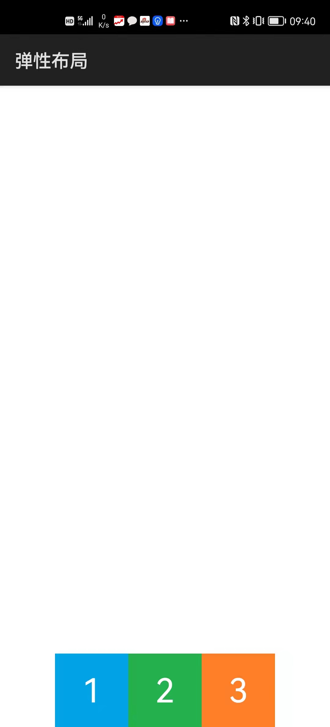
...\Flex\entry\src\main\js\default\pages\start_end\start_end.hml
<div class="div" @swipe="onSwipe">
    <text class="txt1">1</text>
    <text class="txt2">2</text>
    <text class="txt3">3</text>
</div>
...\Flex\entry\src\main\js\default\pages\start_end\start_end.css
.div {
    display: flex;
    flex-direction: row;
    justify-content: flex-start;
    align-items: flex-end;
}

.txt1 {
    width: 80px;
    height: 80px;
    font-size: 36px;
    text-align: center;
    background-color: #00a2e8;
    color: #ffffff;
}

.txt2 {
    width: 80px;
    height: 80px;
    font-size: 36px;
    text-align: center;
    background-color: #22b14c;
    color: #ffffff;
}

.txt3 {
    width: 80px;
    height: 80px;
    font-size: 36px;
    text-align: center;
    background-color: #ff7f27;
    color: #ffffff;
}
...\Flex\entry\src\main\js\default\pages\start_end\start_end.js
import router from '@system.router';

export default {
    onSwipe(e) {
        switch (e.direction) {
            case "left":
                router.push({
                    uri: "pages/center_start/center_start"
                });
                break;

            case "right":
                router.back();
                break;
        }
    }
}
运行效果如下图所示:
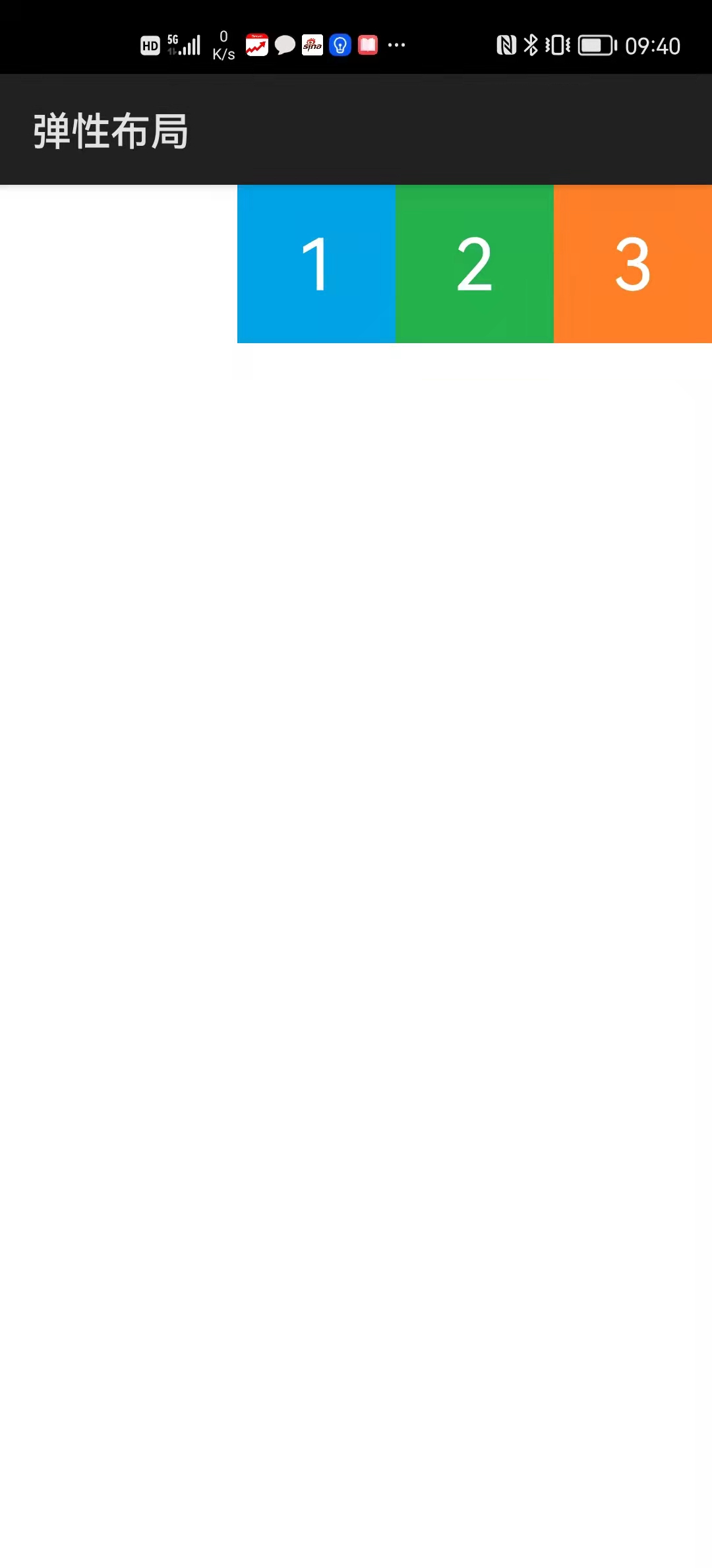
...\Flex\entry\src\main\js\default\pages\center_start\center_start.hml
<div class="div" @swipe="onSwipe">
    <text class="txt1">1</text>
    <text class="txt2">2</text>
    <text class="txt3">3</text>
</div>
...\Flex\entry\src\main\js\default\pages\center_start\center_start.css
.div {
    display: flex;
    flex-direction: row;
    justify-content: center;
    align-items: flex-start;
}

.txt1 {
    width: 80px;
    height: 80px;
    font-size: 36px;
    text-align: center;
    background-color: #00a2e8;
    color: #ffffff;
}

.txt2 {
    width: 80px;
    height: 80px;
    font-size: 36px;
    text-align: center;
    background-color: #22b14c;
    color: #ffffff;
}

.txt3 {
    width: 80px;
    height: 80px;
    font-size: 36px;
    text-align: center;
    background-color: #ff7f27;
    color: #ffffff;
}
...\Flex\entry\src\main\js\default\pages\center_start\center_start.js
import router from '@system.router';

export default {
    onSwipe(e) {
        switch (e.direction) {
            case "left":
                router.push({
                    uri: "pages/center_center/center_center"
                });
                break;

            case "right":
                router.back();
                break;
        }
    }
}
运行效果如下图所示:
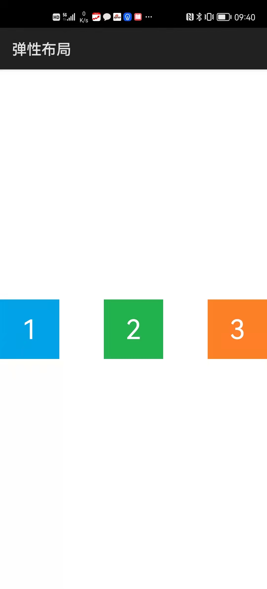
...\Flex\entry\src\main\js\default\pages\center_center\center_center.hml
<div class="div" @swipe="onSwipe">
    <text class="txt1">1</text>
    <text class="txt2">2</text>
    <text class="txt3">3</text>
</div>
...\Flex\entry\src\main\js\default\pages\center_center\center_center.css
.div {
    display: flex;
    flex-direction: row;
    justify-content: center;
    align-items: center;
}

.txt1 {
    width: 80px;
    height: 80px;
    font-size: 36px;
    text-align: center;
    background-color: #00a2e8;
    color: #ffffff;
}

.txt2 {
    width: 80px;
    height: 80px;
    font-size: 36px;
    text-align: center;
    background-color: #22b14c;
    color: #ffffff;
}

.txt3 {
    width: 80px;
    height: 80px;
    font-size: 36px;
    text-align: center;
    background-color: #ff7f27;
    color: #ffffff;
}
...\Flex\entry\src\main\js\default\pages\center_center\center_center.js
import router from '@system.router';

export default {
    onSwipe(e) {
        switch (e.direction) {
            case "left":
                router.push({
                    uri: "pages/center_end/center_end"
                });
                break;

            case "right":
                router.back();
                break;
        }
    }
}
运行效果如下图所示:

...\Flex\entry\src\main\js\default\pages\center_end\center_end.hml
<div class="div" @swipe="onSwipe">
    <text class="txt1">1</text>
    <text class="txt2">2</text>
    <text class="txt3">3</text>
</div>
...\Flex\entry\src\main\js\default\pages\center_end\center_end.css
.div {
    display: flex;
    flex-direction: row;
    justify-content: center;
    align-items: flex-end;
}

.txt1 {
    width: 80px;
    height: 80px;
    font-size: 36px;
    text-align: center;
    background-color: #00a2e8;
    color: #ffffff;
}

.txt2 {
    width: 80px;
    height: 80px;
    font-size: 36px;
    text-align: center;
    background-color: #22b14c;
    color: #ffffff;
}

.txt3 {
    width: 80px;
    height: 80px;
    font-size: 36px;
    text-align: center;
    background-color: #ff7f27;
    color: #ffffff;
}
...\Flex\entry\src\main\js\default\pages\center_end\center_end.js
import router from '@system.router';

export default {
    onSwipe(e) {
        switch (e.direction) {
            case "left":
                router.push({
                    uri: "pages/end_start/end_start"
                });
                break;

            case "right":
                router.back();
                break;
        }
    }
}
运行效果如下图所示:
...\Flex\entry\src\main\js\default\pages\end_start\end_start.hml
<div class="div" @swipe="onSwipe">
    <text class="txt1">1</text>
    <text class="txt2">2</text>
    <text class="txt3">3</text>
</div>
...\Flex\entry\src\main\js\default\pages\end_start\end_start.css
.div {
    display: flex;
    flex-direction: row;
    justify-content: flex-end;
    align-items: flex-start;
}

.txt1 {
    width: 80px;
    height: 80px;
    font-size: 36px;
    text-align: center;
    background-color: #00a2e8;
    color: #ffffff;
}

.txt2 {
    width: 80px;
    height: 80px;
    font-size: 36px;
    text-align: center;
    background-color: #22b14c;
    color: #ffffff;
}

.txt3 {
    width: 80px;
    height: 80px;
    font-size: 36px;
    text-align: center;
    background-color: #ff7f27;
    color: #ffffff;
}
...\Flex\entry\src\main\js\default\pages\end_start\end_start.js
import router from '@system.router';

export default {
    onSwipe(e) {
        switch (e.direction) {
            case "left":
                router.push({
                    uri: "pages/end_center/end_center"
                });
                break;

            case "right":
                router.back();
                break;
        }
    }
}
运行效果如下图所示:
...\Flex\entry\src\main\js\default\pages\end_center\end_center.hml
<div class="div" @swipe="onSwipe">
    <text class="txt1">1</text>
    <text class="txt2">2</text>
    <text class="txt3">3</text>
</div>
...\Flex\entry\src\main\js\default\pages\end_center\end_center.css
.div {
    display: flex;
    flex-direction: row;
    justify-content: flex-end;
    align-items: center;
}

.txt1 {
    width: 80px;
    height: 80px;
    font-size: 36px;
    text-align: center;
    background-color: #00a2e8;
    color: #ffffff;
}

.txt2 {
    width: 80px;
    height: 80px;
    font-size: 36px;
    text-align: center;
    background-color: #22b14c;
    color: #ffffff;
}

.txt3 {
    width: 80px;
    height: 80px;
    font-size: 36px;
    text-align: center;
    background-color: #ff7f27;
    color: #ffffff;
}
...\Flex\entry\src\main\js\default\pages\end_center\end_center.js
import router from '@system.router';

export default {
    onSwipe(e) {
        switch (e.direction) {
            case "left":
                router.push({
                    uri: "pages/end_end/end_end"
                });
                break;

            case "right":
                router.back();
                break;
        }
    }
}
运行效果如下图所示:
...\Flex\entry\src\main\js\default\pages\end_end\end_end.hml
<div class="div" @swipe="onSwipe">
    <text class="txt1">1</text>
    <text class="txt2">2</text>
    <text class="txt3">3</text>
</div>
...\Flex\entry\src\main\js\default\pages\end_end\end_end.css
.div {
    display: flex;
    flex-direction: row;
    justify-content: flex-end;
    align-items: flex-end;
}

.txt1 {
    width: 80px;
    height: 80px;
    font-size: 36px;
    text-align: center;
    background-color: #00a2e8;
    color: #ffffff;
}

.txt2 {
    width: 80px;
    height: 80px;
    font-size: 36px;
    text-align: center;
    background-color: #22b14c;
    color: #ffffff;
}

.txt3 {
    width: 80px;
    height: 80px;
    font-size: 36px;
    text-align: center;
    background-color: #ff7f27;
    color: #ffffff;
}
...\Flex\entry\src\main\js\default\pages\end_end\end_end.js
import router from '@system.router';

export default {
    onSwipe(e) {
        switch (e.direction) {
            case "left":
                router.push({
                    uri: "pages/between_center/between_center"
                });
                break;

            case "right":
                router.back();
                break;
        }
    }
}
运行效果如下图所示:
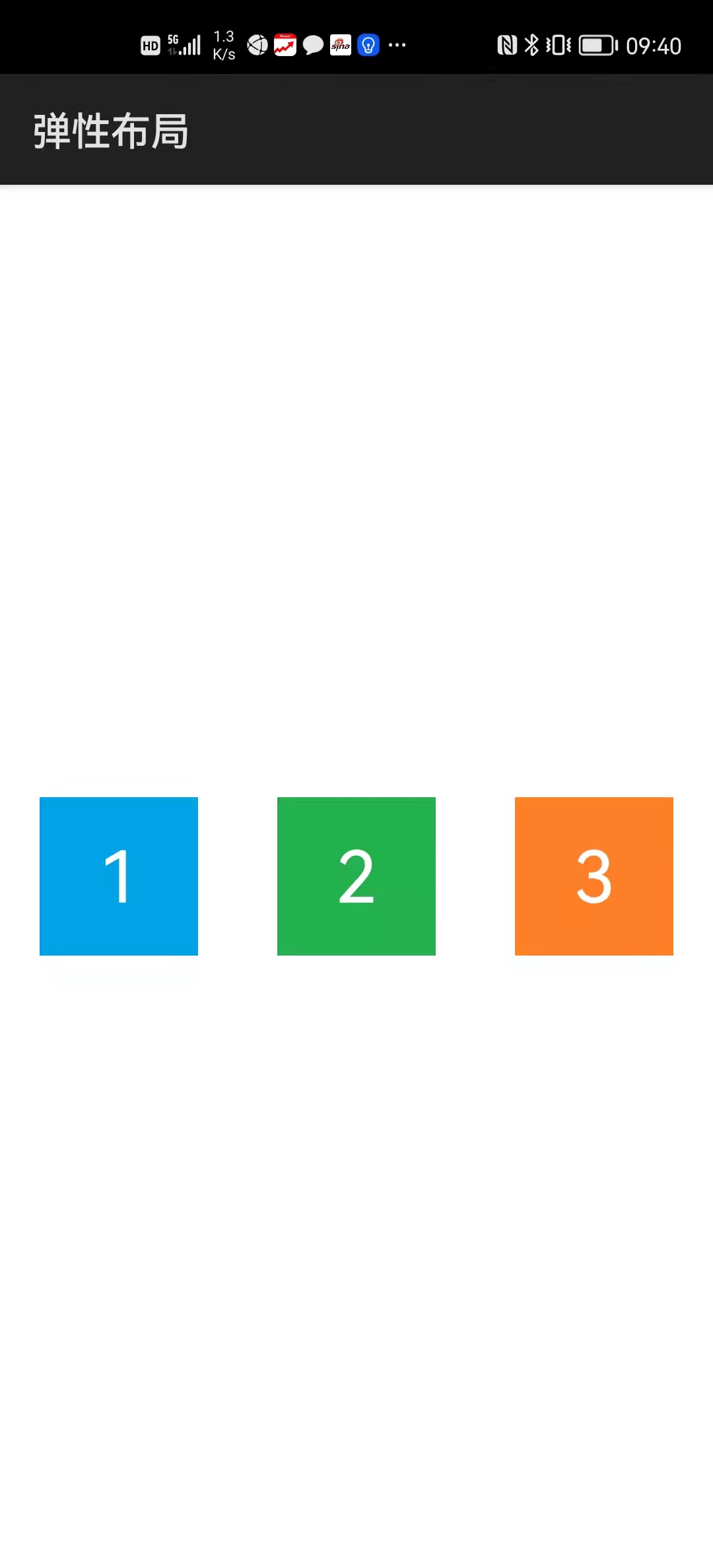
...\Flex\entry\src\main\js\default\pages\between_center\between_center.hml
<div class="div" @swipe="onSwipe">
    <text class="txt1">1</text>
    <text class="txt2">2</text>
    <text class="txt3">3</text>
</div>
...\Flex\entry\src\main\js\default\pages\between_center\between_center.css
.div {
    width: 100%;
    display: flex;
    flex-direction: row;
    justify-content: space-between;
    align-items: center;
}

.txt1 {
    width: 80px;
    height: 80px;
    font-size: 36px;
    text-align: center;
    background-color: #00a2e8;
    color: #ffffff;
}

.txt2 {
    width: 80px;
    height: 80px;
    font-size: 36px;
    text-align: center;
    background-color: #22b14c;
    color: #ffffff;
}

.txt3 {
    width: 80px;
    height: 80px;
    font-size: 36px;
    text-align: center;
    background-color: #ff7f27;
    color: #ffffff;
}
...\Flex\entry\src\main\js\default\pages\between_center\between_center.js
import router from '@system.router';

export default {
    onSwipe(e) {
        switch (e.direction) {
            case "left":
                router.push({
                    uri: "pages/around_center/around_center"
                });
                break;

            case "right":
                router.back();
                break;
        }
    }
}
运行效果如下图所示:
...\Flex\entry\src\main\js\default\pages\around_center\around_center.hml
<div class="div" @swipe="onSwipe">
    <text class="txt1">1</text>
    <text class="txt2">2</text>
    <text class="txt3">3</text>
</div>
...\Flex\entry\src\main\js\default\pages\around_center\around_center.css
.div {
    width: 100%;
    display: flex;
    flex-direction: row;
    justify-content: space-around;
    align-items: center;
}

.txt1 {
    width: 80px;
    height: 80px;
    font-size: 36px;
    text-align: center;
    background-color: #00a2e8;
    color: #ffffff;
}

.txt2 {
    width: 80px;
    height: 80px;
    font-size: 36px;
    text-align: center;
    background-color: #22b14c;
    color: #ffffff;
}

.txt3 {
    width: 80px;
    height: 80px;
    font-size: 36px;
    text-align: center;
    background-color: #ff7f27;
    color: #ffffff;
}
...\Flex\entry\src\main\js\default\pages\around_center\around_center.js
import router from '@system.router';

export default {
    onSwipe(e) {
        switch (e.direction) {
            case "left":
                router.push({
                    uri: "pages/around_stretch/around_stretch"
                });
                break;

            case "right":
                router.back();
                break;
        }
    }
}
运行效果如下图所示:
...\Flex\entry\src\main\js\default\pages\around_stretch\around_stretch.hml
<div class="div" @swipe="onSwipe">
    <text class="txt1">1</text>
    <text class="txt2">2</text>
    <text class="txt3">3</text>
</div>
...\Flex\entry\src\main\js\default\pages\around_stretch\around_stretch.css
.div {
    width: 100%;
    height: 100%;
    display: flex;
    flex-direction: row;
    justify-content: space-around;
    align-items: stretch;
}

.txt1 {
    width: 80px;
    font-size: 36px;
    text-align: center;
    background-color: #00a2e8;
    color: #ffffff;
}

.txt2 {
    width: 80px;
    font-size: 36px;
    text-align: center;
    background-color: #22b14c;
    color: #ffffff;
}

.txt3 {
    width: 80px;
    font-size: 36px;
    text-align: center;
    background-color: #ff7f27;
    color: #ffffff;
}
...\Flex\entry\src\main\js\default\pages\around_stretch\around_stretch.js
import router from '@system.router';

export default {
    onSwipe(e) {
        switch (e.direction) {
            case "left":
                router.push({
                    uri: "pages/nowrap/nowrap"
                });
                break;

            case "right":
                router.back();
                break;
        }
    }
}
运行效果如下图所示:
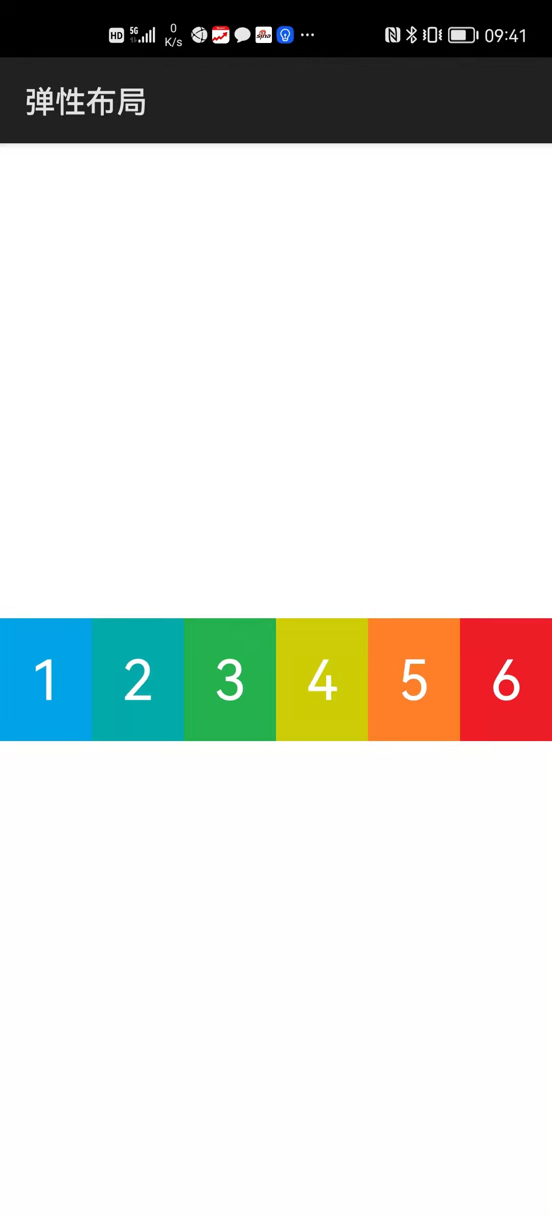
...\Flex\entry\src\main\js\default\pages\nowrap\nowrap.hml
<div class="div" @swipe="onSwipe">
    <text class="txt1">1</text>
    <text class="txt2">2</text>
    <text class="txt3">3</text>
    <text class="txt4">4</text>
    <text class="txt5">5</text>
    <text class="txt6">6</text>
</div>
...\Flex\entry\src\main\js\default\pages\nowrap\nowrap.css
.div {
    display: flex;
    flex-direction: row;
    flex-wrap: nowrap;
    justify-content: center;
    align-items: center;
}

.txt1 {
    width: 80px;
    height: 80px;
    font-size: 36px;
    text-align: center;
    background-color: #00a2e8;
    color: #ffffff;
}

.txt2 {
    width: 80px;
    height: 80px;
    font-size: 36px;
    text-align: center;
    background-color: #00aaaa;
    color: #ffffff;
}

.txt3 {
    width: 80px;
    height: 80px;
    font-size: 36px;
    text-align: center;
    background-color: #22b14c;
    color: #ffffff;
}

.txt4 {
    width: 80px;
    height: 80px;
    font-size: 36px;
    text-align: center;
    background-color: #cccc00;
    color: #ffffff;
}

.txt5 {
    width: 80px;
    height: 80px;
    font-size: 36px;
    text-align: center;
    background-color: #ff7f27;
    color: #ffffff;
}

.txt6 {
    width: 80px;
    height: 80px;
    font-size: 36px;
    text-align: center;
    background-color: #ee1c24;
    color: #ffffff;
}
...\Flex\entry\src\main\js\default\pages\nowrap\nowrap.js
import router from '@system.router';

export default {
    onSwipe(e) {
        switch (e.direction) {
            case "left":
                router.push({
                    uri: "pages/wrap/wrap"
                });
                break;

            case "right":
                router.back();
                break;
        }
    }
}
运行效果如下图所示:
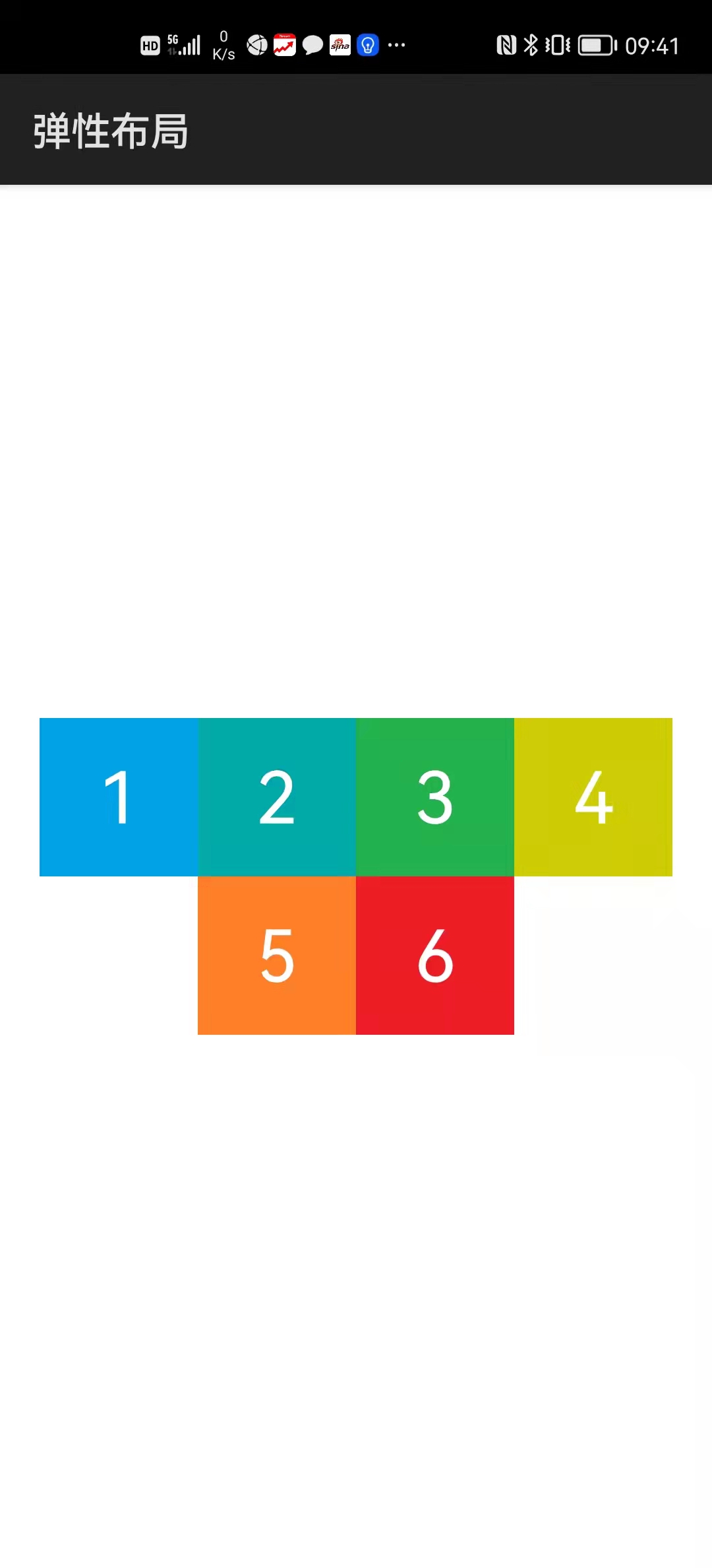
...\Flex\entry\src\main\js\default\pages\wrap\wrap.hml
<div class="div" @swipe="onSwipe">
    <text class="txt1">1</text>
    <text class="txt2">2</text>
    <text class="txt3">3</text>
    <text class="txt4">4</text>
    <text class="txt5">5</text>
    <text class="txt6">6</text>
</div>
...\Flex\entry\src\main\js\default\pages\wrap\wrap.css
.div {
    height: 100%;
    display: flex;
    flex-direction: row;
    flex-wrap: wrap;
    justify-content: center;
    align-content: center;
}

.txt1 {
    width: 80px;
    height: 80px;
    font-size: 36px;
    text-align: center;
    background-color: #00a2e8;
    color: #ffffff;
}

.txt2 {
    width: 80px;
    height: 80px;
    font-size: 36px;
    text-align: center;
    background-color: #00aaaa;
    color: #ffffff;
}

.txt3 {
    width: 80px;
    height: 80px;
    font-size: 36px;
    text-align: center;
    background-color: #22b14c;
    color: #ffffff;
}

.txt4 {
    width: 80px;
    height: 80px;
    font-size: 36px;
    text-align: center;
    background-color: #cccc00;
    color: #ffffff;
}

.txt5 {
    width: 80px;
    height: 80px;
    font-size: 36px;
    text-align: center;
    background-color: #ff7f27;
    color: #ffffff;
}

.txt6 {
    width: 80px;
    height: 80px;
    font-size: 36px;
    text-align: center;
    background-color: #ee1c24;
    color: #ffffff;
}
...\Flex\entry\src\main\js\default\pages\wrap\wrap.js
import router from '@system.router';

export default {
    onSwipe(e) {
        switch (e.direction) {
            case "left":
                router.push({
                    uri: "pages/wrap_around/wrap_around"
                });
                break;

            case "right":
                router.back();
                break;
        }
    }
}
运行效果如下图所示:
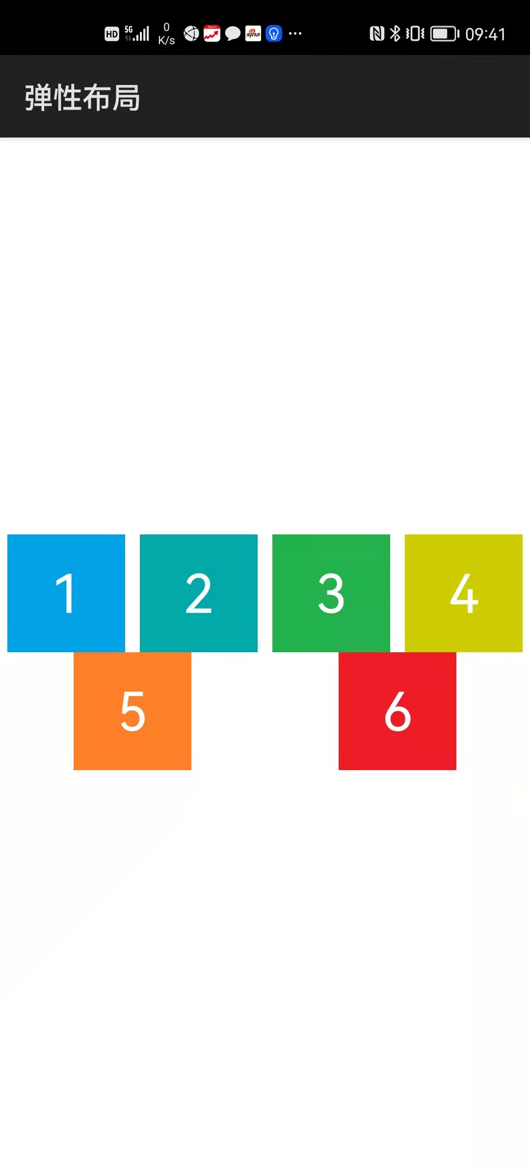
...\Flex\entry\src\main\js\default\pages\wrap_around\wrap_around.hml
<div class="div" @swipe="onSwipe">
    <text class="txt1">1</text>
    <text class="txt2">2</text>
    <text class="txt3">3</text>
    <text class="txt4">4</text>
    <text class="txt5">5</text>
    <text class="txt6">6</text>
</div>
...\Flex\entry\src\main\js\default\pages\wrap_around\wrap_around.css
.div {
    height: 100%;
    display: flex;
    flex-direction: row;
    flex-wrap: wrap;
    justify-content: space-around;
    align-content: center;
}

.txt1 {
    width: 80px;
    font-size: 36px;
    text-align: center;
    background-color: #00a2e8;
    color: #ffffff;
}

.txt2 {
    width: 80px;
    height: 80px;
    font-size: 36px;
    text-align: center;
    background-color: #00aaaa;
    color: #ffffff;
}

.txt3 {
    width: 80px;
    height: 80px;
    font-size: 36px;
    text-align: center;
    background-color: #22b14c;
    color: #ffffff;
}

.txt4 {
    width: 80px;
    height: 80px;
    font-size: 36px;
    text-align: center;
    background-color: #cccc00;
    color: #ffffff;
}

.txt5 {
    width: 80px;
    height: 80px;
    font-size: 36px;
    text-align: center;
    background-color: #ff7f27;
    color: #ffffff;
}

.txt6 {
    width: 80px;
    height: 80px;
    font-size: 36px;
    text-align: center;
    background-color: #ee1c24;
    color: #ffffff;
}
...\Flex\entry\src\main\js\default\pages\wrap_around\wrap_around.js
import router from '@system.router';

export default {
    onSwipe(e) {
        if (e.direction == "right")
            router.back();
    }
}
运行效果如下图所示:
3.1.2 网格布局(grid)
网格布局可以使所包含的组件按行列排布,包含如下样式:
| grid | 描述 |
|---|---|
| grid-template-rows | 行数和行高 |
| grid-rows-gap | 行间距 |
| grid-template-columns | 列数和列宽 |
| grid-columns-gap | 列间距 |
其中grid-template-rows和grid-template-columns样式的定义方式包括以下几种:
| grid-template-rows grid-template-columns |
示例 |
|---|---|
| 按权重定义 | grid-template-rows: 1fr 3fr 6fr; |
| 按百分比定义 | grid-template-rows: 10% 30% 60%; |
| 按像素定义 | grid-template-rows: 100px 300px 600px; |
可以通过repeat和auto关键字简化书写:
| 简化关键字 | 描述 | 示例 |
|---|---|---|
| repeat | 表示重复 | grid-template-rows: repeat(3, 200px); 等价于 grid-template-rows: 200px 200px 200px; |
| auto | 表示根据内部组件的大小自动匹配 | grid-template-rows: auto 1fr 2fr; |
网格布局中的单元布局通过如下样式确定其位置和大小:
| 单元格布局 | 描述 |
|---|---|
| grip-row-start | 起始行号 |
| grip-row-end | 终止行号 |
| grip-column-start | 起始列号 |
| grip-column-end | 终止列号 |
例程:Grid
...\Grid\entry\src\main\js\default\pages\index\index.hml
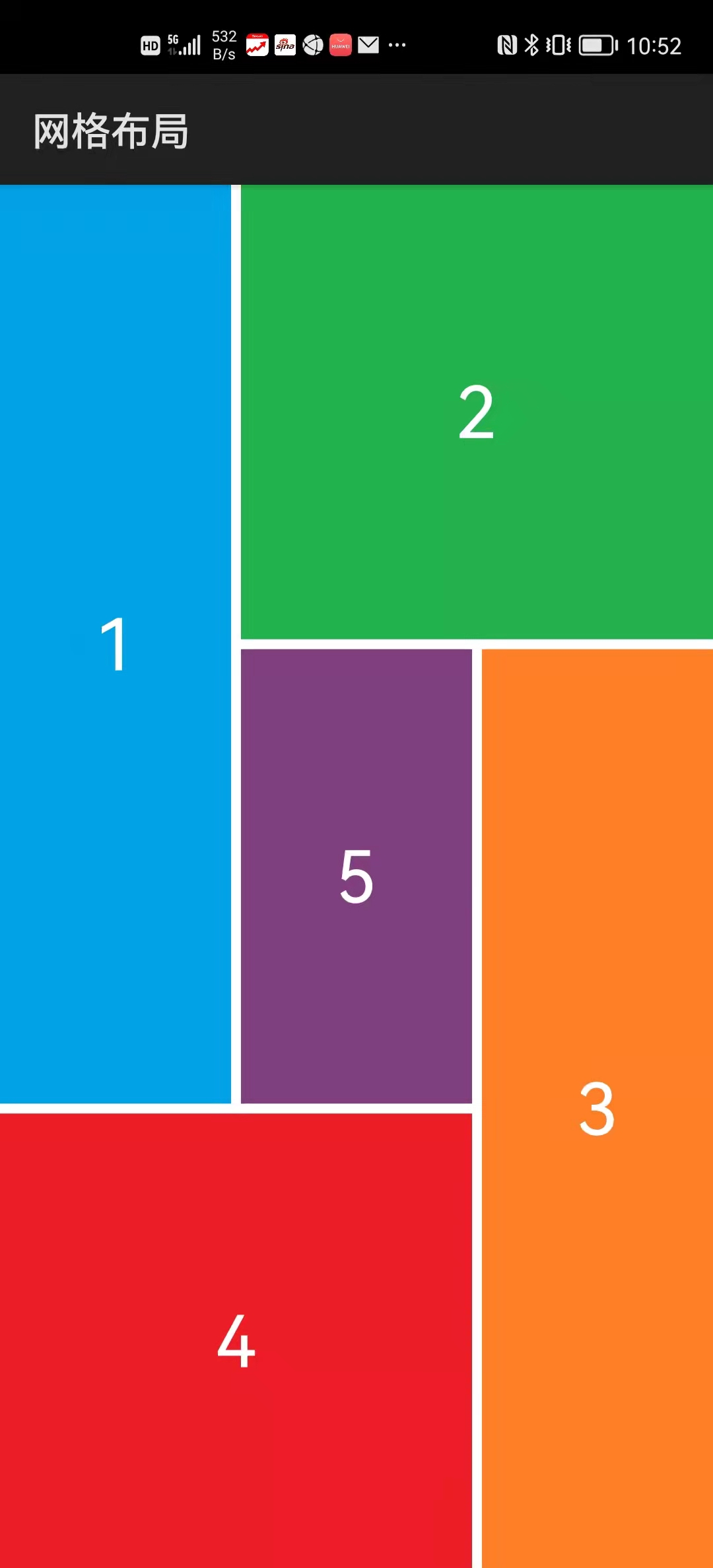
<div class="divPage">
    <div class="divLeftTop">
        <text class="txt">1</text>
    </div>
    <div class="divRightTop">
        <text class="txt">2</text>
    </div>
    <div class="divRightBottom">
        <text class="txt">3</text>
    </div>
    <div class="divLeftBottom">
        <text class="txt">4</text>
    </div>
    <div class="divCenter">
        <text class="txt">5</text>
    </div>
</div>
...\Grid\entry\src\main\js\default\pages\index\index.css
.divPage {
    display: grid;
    grid-template-rows: 1fr  1fr  1fr;
    grid-rows-gap: 5px;
    grid-template-columns: 1fr  1fr  1fr;
    grid-columns-gap: 5px;
}

.divLeftTop {
    width: 100%;
    height: 100%;
    justify-content: center;
    grid-row-start: 0;
    grid-row-end: 1;
    grid-column-start: 0;
    grid-column-end: 0;
    background-color: #00a2e8;
}

.divRightTop {
    width: 100%;
    height: 100%;
    justify-content: center;
    grid-row-start: 0;
    grid-row-end: 0;
    grid-column-start: 1;
    grid-column-end: 2;
    background-color: #22b14c;
}

.divRightBottom {
    width: 100%;
    height: 100%;
    justify-content: center;
    grid-row-start: 1;
    grid-row-end: 2;
    grid-column-start: 2;
    grid-column-end: 2;
    background-color: #ff7f27;
}

.divLeftBottom {
    width: 100%;
    height: 100%;
    justify-content: center;
    grid-row-start: 2;
    grid-row-end: 2;
    grid-column-start: 0;
    grid-column-end: 1;
    background-color: #ee1c24;
}

.divCenter {
    width: 100%;
    height: 100%;
    justify-content: center;
    grid-row-start: 1;
    grid-row-end: 1;
    grid-column-start: 1;
    grid-column-end: 1;
    background-color: #804080;
}

.txt {
    font-size: 36px;
    color: #ffffff;
}
运行效果如下图所示:
3.2 列表容器(list)
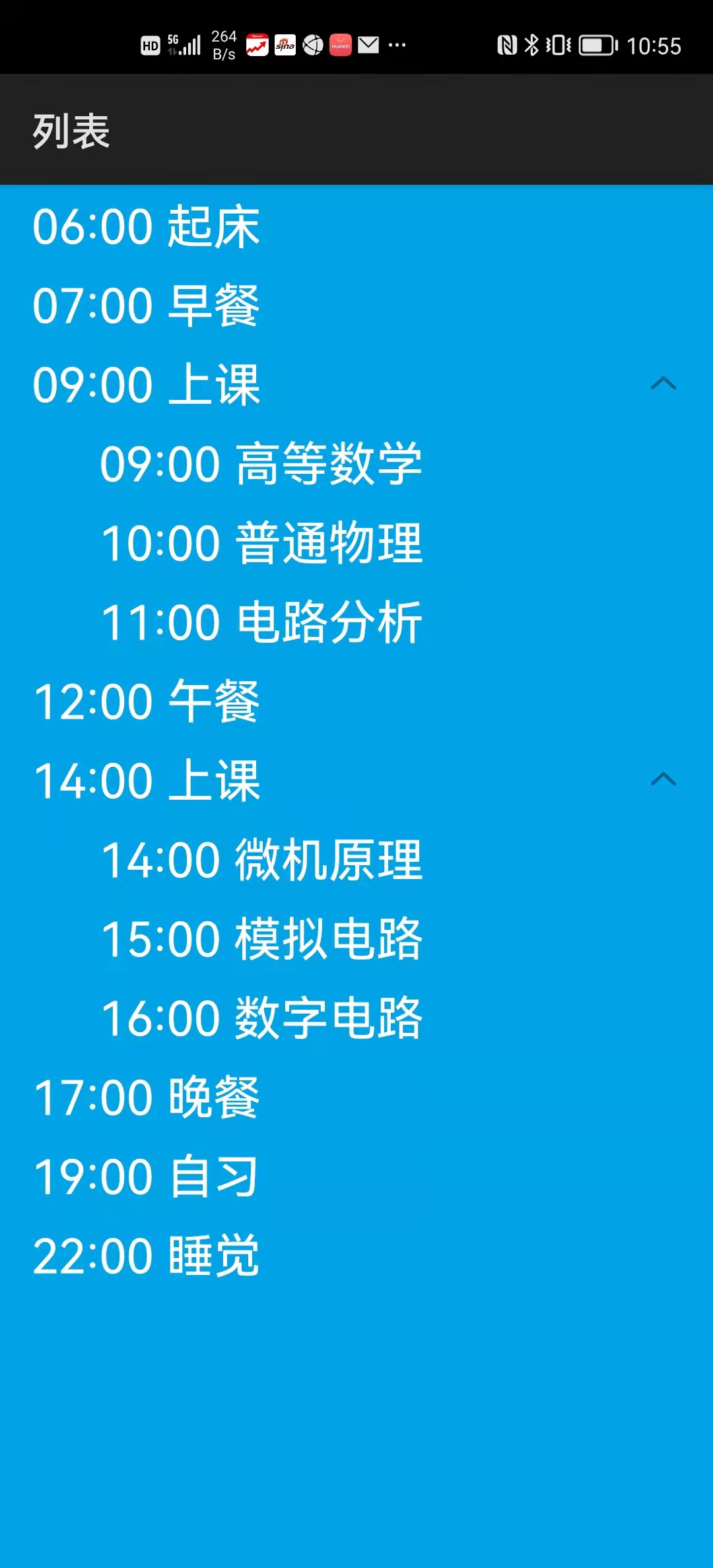
列表容器的子组件只能是列表项(list-item)和列表项组(list-item-group),而列表项组(list-item-group)的子组件只能是列表项(list-item)。其它组件都需要放在列表项(list-item)的内部。
例程:List
...\List\entry\src\main\js\default\pages\index\index.hml
<list class="lst">
    <list-item><text class="txt">06:00 起床</text></list-item>
    <list-item><text class="txt">07:00 早餐</text></list-item>

    <list-item-group>
        <list-item><text class="txt">09:00 上课</text></list-item>

        <list-item class="grp">
            <text class="txt">09:00 高等数学</text>
        </list-item>
        <list-item class="grp">
            <text class="txt">10:00 普通物理</text>
        </list-item>
        <list-item class="grp">
            <text class="txt">11:00 电路分析</text>
        </list-item>
    </list-item-group>

    <list-item><text class="txt">12:00 午餐</text></list-item>

    <list-item-group>
        <list-item><text class="txt">14:00 上课</text></list-item>

        <list-item class="grp">
            <text class="txt">14:00 微机原理</text>
        </list-item>
        <list-item class="grp">
            <text class="txt">15:00 模拟电路</text>
        </list-item>
        <list-item class="grp">
            <text class="txt">16:00 数字电路</text>
        </list-item>
    </list-item-group>

    <list-item><text class="txt">17:00 晚餐</text></list-item>
    <list-item><text class="txt">19:00 自习</text></list-item>
    <list-item><text class="txt">22:00 睡觉</text></list-item>
</list>
...\List\entry\src\main\js\default\pages\index\index.css
.lst {
    padding-left: 16px;
    background-color: #00a2e8;
}

.grp {
    margin-left: 34px;
}

.txt {
    height: 40px;
    font-size: 24px;
    color: #ffffff;
}
运行效果如下图所示:
3.3 堆叠容器(stack)
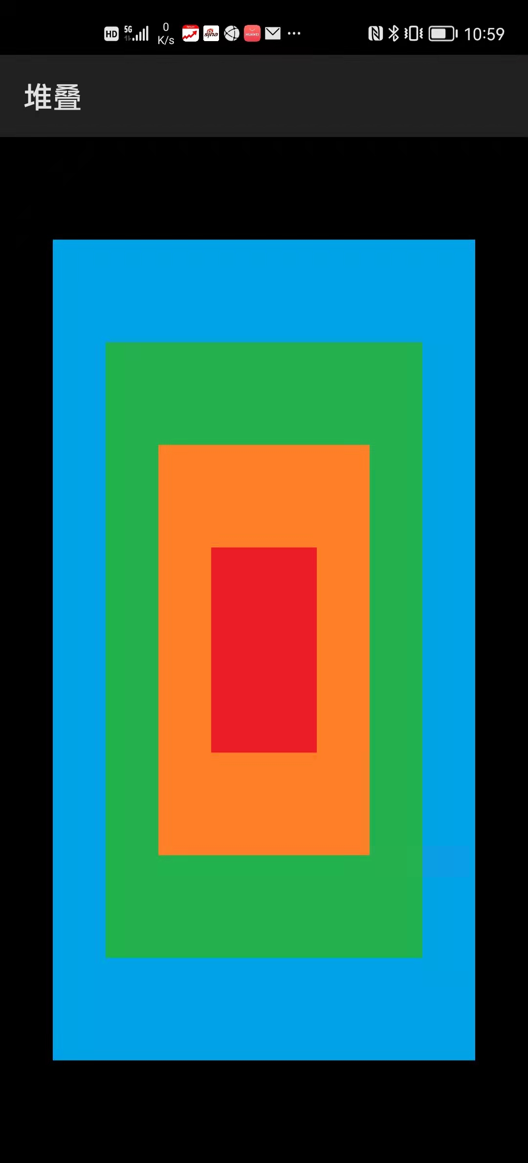
堆叠容器中的组件会依次堆叠起来。
例程:Stack
...\Stack\entry\src\main\js\default\pages\index\index.hml
<stack class="stc">
    <text class="txt1"></text>
    <text class="txt2"></text>
    <text class="txt3"></text>
    <text class="txt4"></text>
</stack>
...\Stack\entry\src\main\js\default\pages\index\index.css
.stc {
    width: 100%;
    height: 100%;
    justify-content: center;
    align-items: center;
    background-color: #000000;
}

.txt1 {
    width: 80%;
    height: 80%;
    background-color: #00a2e8;
}

.txt2 {
    width: 60%;
    height: 60%;
    background-color: #22b14c;
}

.txt3 {
    width: 40%;
    height: 40%;
    background-color: #ff7f27;
}

.txt4 {
    width: 20%;
    height: 20%;
    background-color: #ee1c24;
}
运行效果如下图所示:
3.4 滑页容器(swiper)
滑页容器允许用户以滑动方式切换用户界面,其常用属性包括:
| swiper | 描述 |
|---|---|
| index | 当前显示组件的索引,默认0 |
| autoplay | 是否自动播放,默认false |
| interval | 自动播放时切换组件的时间间隔,单位毫秒,默认3000毫秒 |
| loop | 以循环方式切换组件,默认true |
| duration | 组件切换动画的时长 |
| indicator | 是否显示导航点指示器,默认true |
| vertical | 是否纵向滑动,默认false |
导航点指示器的样式包括:
| 导航点指示器 | 描述 |
|---|---|
| indicator-color | 导航点颜色 |
| indicator-selected-color | 选中导航点颜色 |
| indicator-size | 导航点大小 |
| indicator-left | 导航点指示器相对于滑页组件的左边距 |
| indicator-top | 导航点指示器相对于滑页组件的顶边距 |
| indicator-right | 导航点指示器相对于滑页组件的右边距 |
| indicator-bottom | 导航点指示器相对于滑页组件的底边距 |
滑页容器的常用方法包括:
| 方法 | 描述 |
|---|---|
| swipTo(index) | 跳转到指定组件 |
| showNext() | 跳转到下一个组件 |
| showPrevious() | 跳转到上一个组件 |
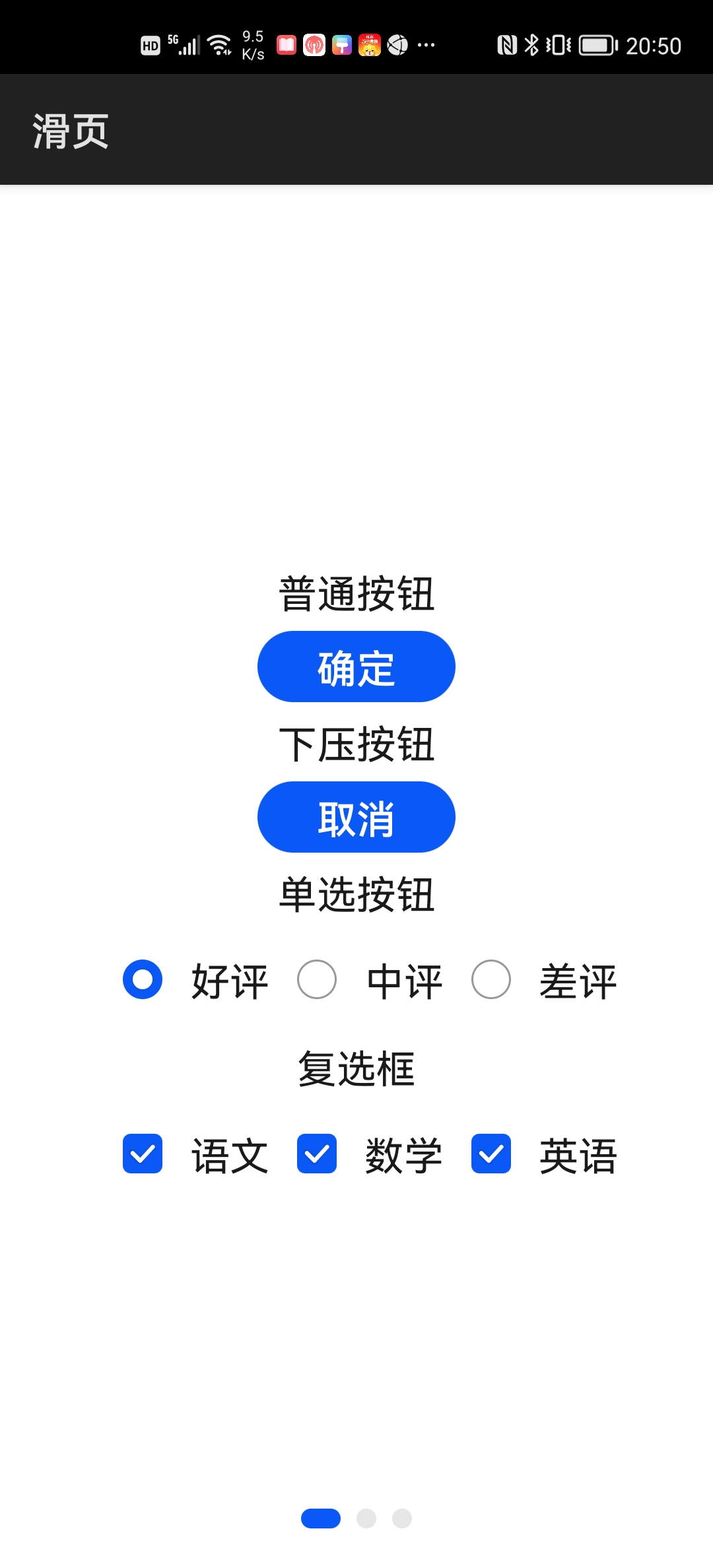
例程:Swiper
...\Swiper\entry\src\main\js\default\pages\index\index.hml
<swiper class="swp" loop="false">
    <div class="divColumn">
        <text class="txt">普通按钮</text>
        <button class="btn">确定</button>

        <text class="txt">下压按钮</text>
        <input class="btn" type="button" value="取消" />

        <text class="txt">单选按钮</text>
        <div class="divRow">
            <input type="radio" name="review" id="good" value="1"
                   checked="true" />
            <label class="lab" target="good">好评</label>

            <input type="radio" name="review" id="medium" value="2" />
            <label class="lab" target="medium">中评</label>

            <input type="radio" name="review" id="bad" value="3" />
            <label class="lab" target="bad">差评</label>
        </div>

        <text class="txt">复选框</text>
        <div class="divRow">
            <input type="checkbox" id="chinese" checked="true" />
            <label class="lab" target="chinese">语文</label>

            <input type="checkbox" id="math" checked="true" />
            <label class="lab" target="math">数学</label>

            <input type="checkbox" id="english" checked="true" />
            <label class="lab" target="english">英语</label>
        </div>
    </div>

    <div class="divColumn">
        <text class="txt">普通编辑框</text>
        <input class="sin" type="text" placeholder="请输入文本" />

        <text class="txt">邮箱编辑框</text>
        <input class="sin" type="email" placeholder="请输入邮箱" />

        <text class="txt">数字编辑框</text>
        <input class="sin" type="number" placeholder="请输入数字" />

        <text class="txt">密码编辑框</text>
        <input class="sin" type="password" placeholder="请输入密码" />

        <text class="txt">日期编辑框</text>
        <input class="sin" type="date" placeholder="请输入日期" />

        <text class="txt">时间编辑框</text>
        <input class="sin" type="time" placeholder="请输入时间" />

        <text class="txt">搜索编辑框</text>
        <search class="sin" hint="请输入搜索内容" />
    </div>

    <div class="divColumn">
        <text class="txt">滑竿</text>
        <slider min="0" max="1000" value="500" />

        <text class="txt">评分条</text>
        <rating rating="2.5" />

        <text class="txt">开关选择器</text>
        <switch class="swt" texton="开启" textoff="关闭" showtext="true"
                checked="true" />
    </div>
</swiper>
...\Swiper\entry\src\main\js\default\pages\index\index.css
.swp {
    indicator-size: 10px;
}

.divColumn {
    flex-direction: column;
    justify-content: center;
    align-items: center;
    padding: 20px;
}

.txt {
    height: 40px;
    font-size: 20px;
}

.btn {
    width: 100px;
    height: 36px;
    font-size: 20px;
}

.divRow {
    flex-direction: row;
    justify-content: center;
    align-items: center
}

.lab {
    font-size: 20px;
}

.sin {
    font-size: 20px;
}

.swt {
    font-size: 20px;
}
运行效果如下图所示:
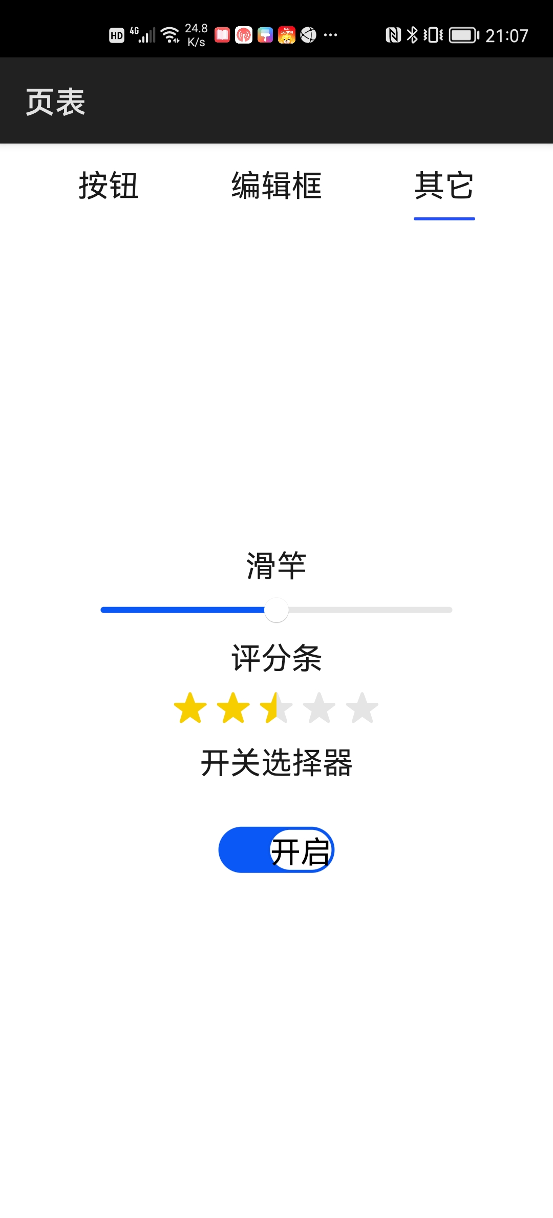
3.5 页表容器(tabs)
页表容器只能容纳表头(tab-bar)和表内容(tab-content)两种组件,后者包含了多个子组件。用户通过点击表头或滑动屏幕,在多个子组件之间切换。
页表容器的常用属性包括:
| tabs | 描述 |
|---|---|
| index | 当前显示组件的索引,默认0 |
| vertical | 是否纵向排列,默认false |
表头组件的mode属性可取以下值:
| mode | 描述 |
|---|---|
| scrollable | 每个表头项的宽度由其内容决定,超过屏幕宽度可滚动显示 |
| fixed | 每个表头项的宽度都相同且不能滚动 |
表内容组件的scrollable属性,决定用户是否可以通过滑动方式切换子组件,默认为true。
例程:Tabs
...\Tabs\entry\src\main\js\default\pages\index\index.hml
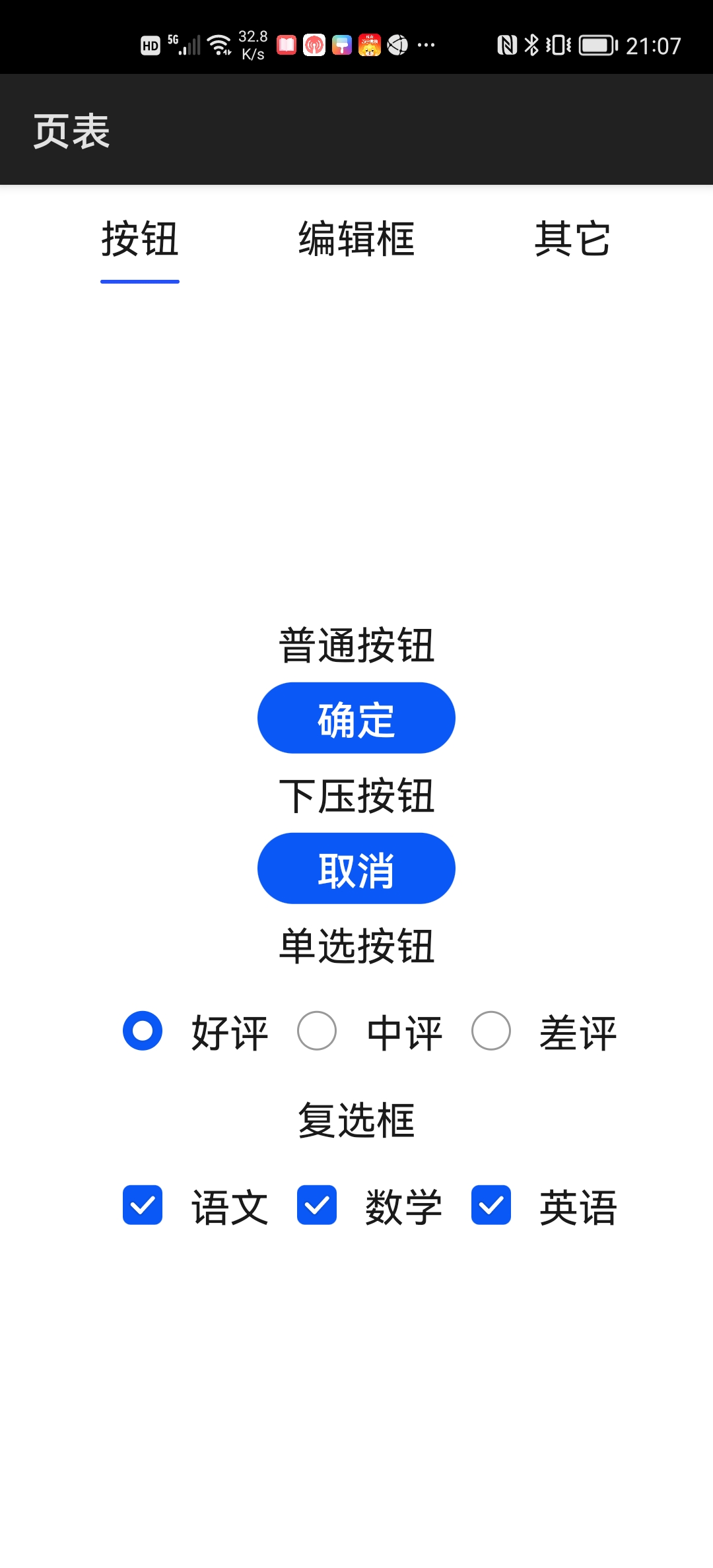
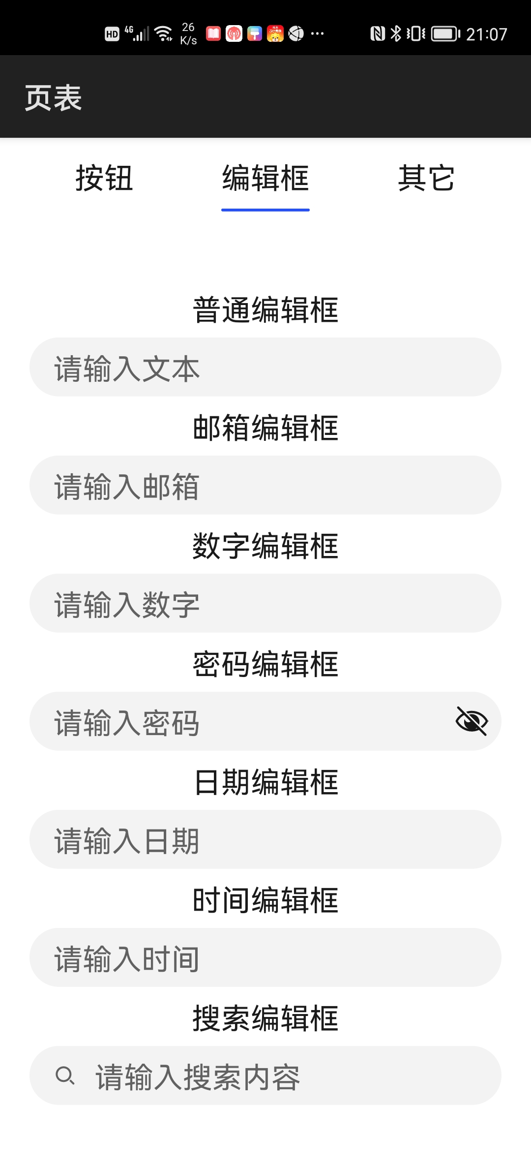
<tabs>
    <tab-bar mode="fixed">
        <text class="txt">按钮</text>
        <text class="txt">编辑框</text>
        <text class="txt">其它</text>
    </tab-bar>

    <tab-content>
        <div class="divColumn">
            <text class="txt">普通按钮</text>
            <button class="btn">确定</button>

            <text class="txt">下压按钮</text>
            <input class="btn" type="button" value="取消" />

            <text class="txt">单选按钮</text>
            <div class="divRow">
                <input type="radio" name="review" id="good" value="1"
                       checked="true" />
                <label class="lab" target="good">好评</label>

                <input type="radio" name="review" id="medium" value="2" />
                <label class="lab" target="medium">中评</label>

                <input type="radio" name="review" id="bad" value="3" />
                <label class="lab" target="bad">差评</label>
            </div>

            <text class="txt">复选框</text>
            <div class="divRow">
                <input type="checkbox" id="chinese" checked="true" />
                <label class="lab" target="chinese">语文</label>

                <input type="checkbox" id="math" checked="true" />
                <label class="lab" target="math">数学</label>

                <input type="checkbox" id="english" checked="true" />
                <label class="lab" target="english">英语</label>
            </div>
        </div>

        <div class="divColumn">
            <text class="txt">普通编辑框</text>
            <input class="sin" type="text" placeholder="请输入文本" />

            <text class="txt">邮箱编辑框</text>
            <input class="sin" type="email" placeholder="请输入邮箱" />

            <text class="txt">数字编辑框</text>
            <input class="sin" type="number" placeholder="请输入数字" />

            <text class="txt">密码编辑框</text>
            <input class="sin" type="password" placeholder="请输入密码" />

            <text class="txt">日期编辑框</text>
            <input class="sin" type="date" placeholder="请输入日期" />

            <text class="txt">时间编辑框</text>
            <input class="sin" type="time" placeholder="请输入时间" />

            <text class="txt">搜索编辑框</text>
            <search class="sin" hint="请输入搜索内容" />
        </div>

        <div class="divColumn">
            <text class="txt">滑竿</text>
            <slider min="0" max="1000" value="500" />

            <text class="txt">评分条</text>
            <rating rating="2.5" />

            <text class="txt">开关选择器</text>
            <switch class="swt" texton="开启" textoff="关闭" showtext="true"
                    checked="true" />
        </div>
    </tab-content>
</tabs>
...\Tabs\entry\src\main\js\default\pages\index\index.css
.txt {
    height: 40px;
    font-size: 20px;
}

.divColumn {
    flex-direction: column;
    justify-content: center;
    align-items: center;
    padding: 20px;
}

.btn {
    width: 100px;
    height: 36px;
    font-size: 20px;
}

.divRow {
    flex-direction: row;
    justify-content: center;
    align-items: center
}

.lab {
    font-size: 20px;
}

.sin {
    font-size: 20px;
}

.swt {
    font-size: 20px;
}
运行效果如下图所示:
4 对话框
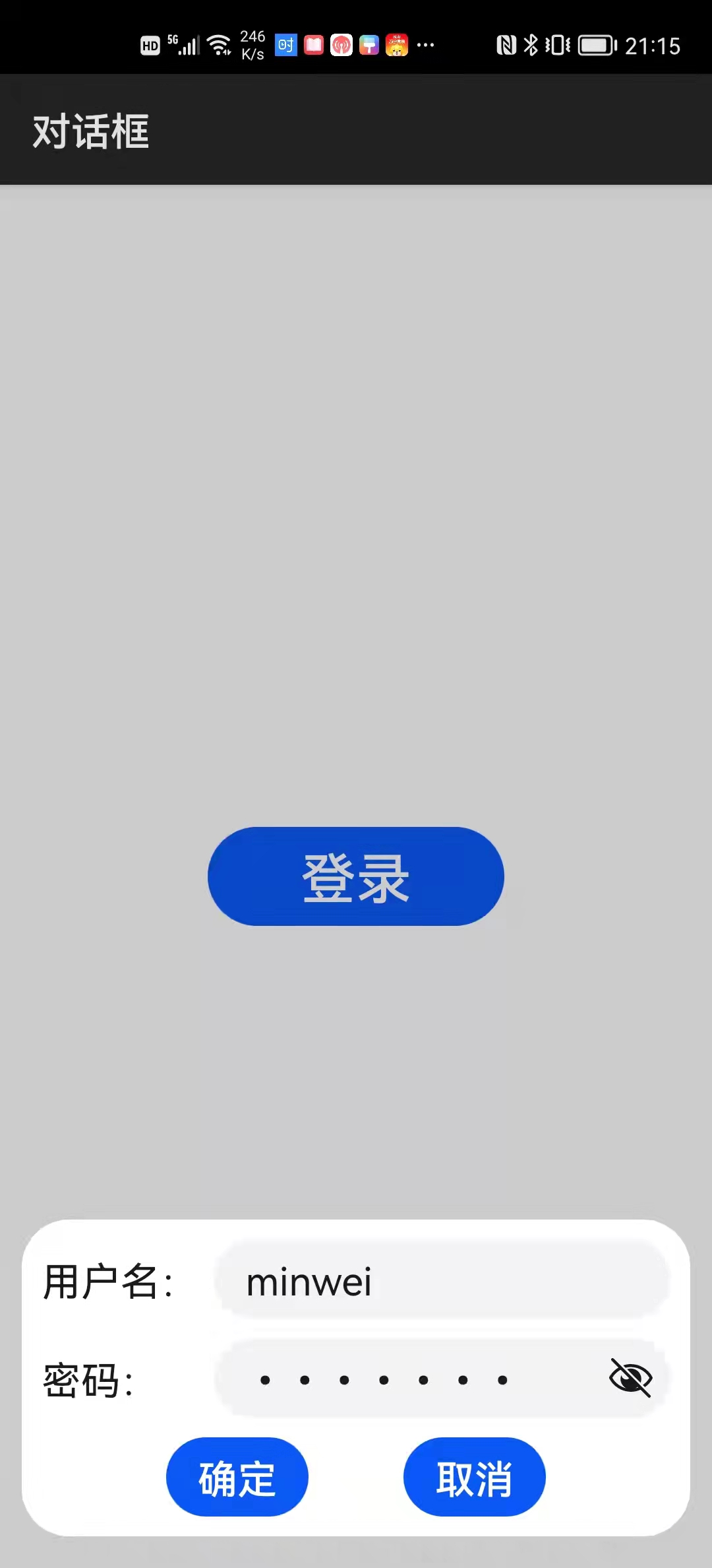
4.1 dialog组件
开发者在.hml文件中通过dialog组件定义对话框,但其并不会直接显示界面中,只有当需要显示该对话框时,显示调用其show()方法,对话框才会显示出来,并在需要关闭该对话框时,调用其close()方法。
例程:Dialog
...\Dialog\entry\src\main\js\default\pages\index\index.hml
<div class="divPage">
    <input class="btnLogin" type="button" value="登录" @click="onLogin" />

    <dialog ref="dlg">
        <div class="divColumn">
            <div class="divRow">
                <text class="txt">用户名:</text>
                <input class="edt" type="text" placeholder="请输入用户名" />
            </div>

            <div class="divRow">
                <text class="txt">密码:</text>
                <input class="edt" type="password" placeholder="请输入密码" />
            </div>

            <div class="divRow">
                <input class="btnOk" type="button" value="确定"
                       @click="onOk"/>
                <input class="btnCancel" type="button" value="取消"
                       @click="onCancel"/>
            </div>
        </div>
    </dialog>
</div>
...\Dialog\entry\src\main\js\default\pages\index\index.css
.divPage {
    flex-direction: column;
    justify-content: center;
    align-items: center;
}

.btnLogin {
    width: 150px;
    height: 50px;
    font-size: 28px;
}

.divColumn {
    padding: 5px;
    flex-direction: column;
}

.divRow {
    margin: 5px;
    flex-direction: row;
    justify-content: center;
}

.txt {
    width: 120px;
    font-size: 20px;
}

.edt {
    font-size: 20px;
}

.btnOk {
    margin-right: 24;
    font-size: 20px;
}

.btnCancel {
    margin-left: 24px;
    font-size: 20px;
}
...\Dialog\entry\src\main\js\default\pages\index\index.js
export default {
    onLogin() {
        this.$refs.dlg.show();
    },
    onOk() {
        this.$refs.dlg.close();
    },
    onCancel() {
        this.$refs.dlg.close();
    }
}
运行效果如下图所示:
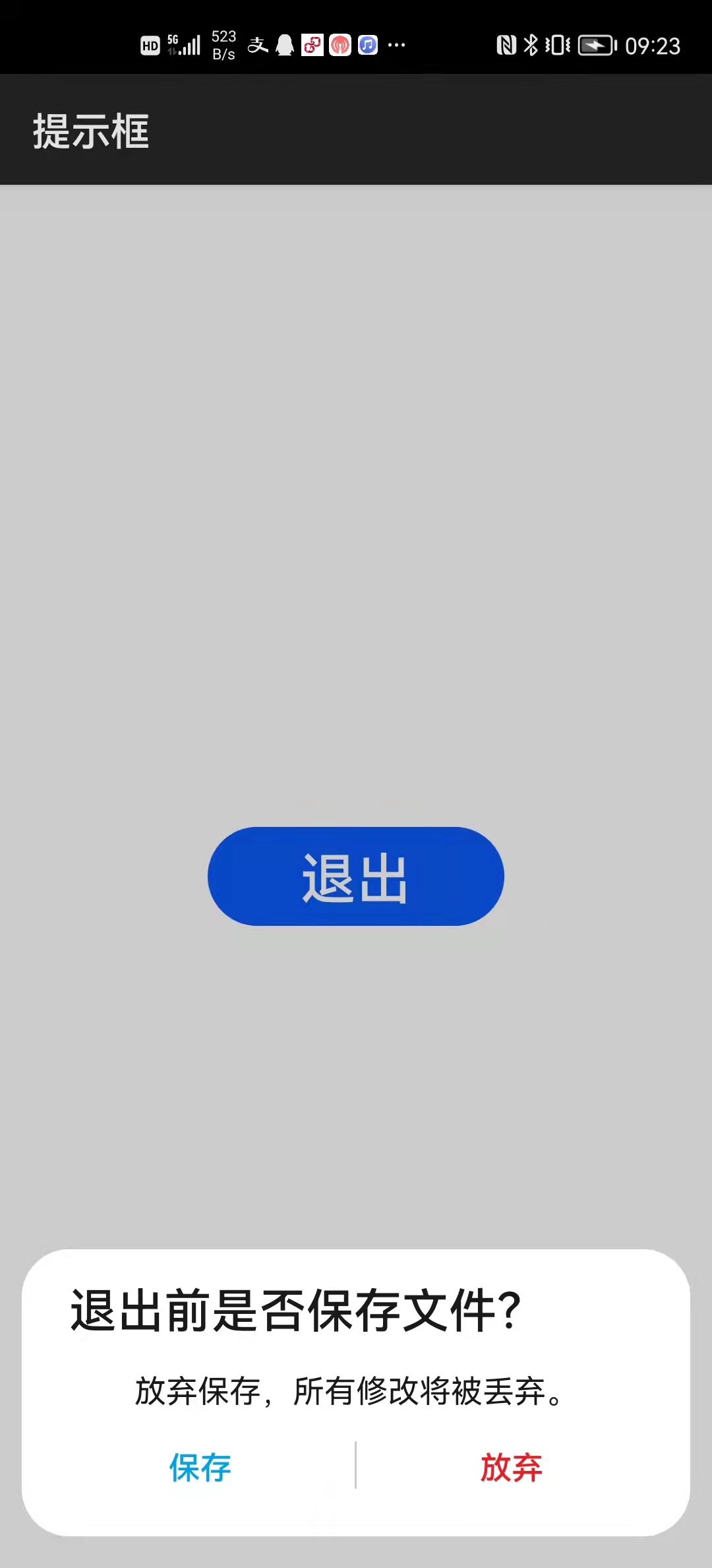
4.2 prompt模块
import prompt from "@system.prompt";
prompt.showDialog({
    title: "保存文件",
    message: "是否保存对当前文件所做的修改?",
    buttons: [
        {text: "保存", color: "#00a2e8"},
        {text: "放弃", color: "#00a2e8"}],
    success: function(data) {
        ...data.index...
    },
    cancel: function() {
        ...
    }});
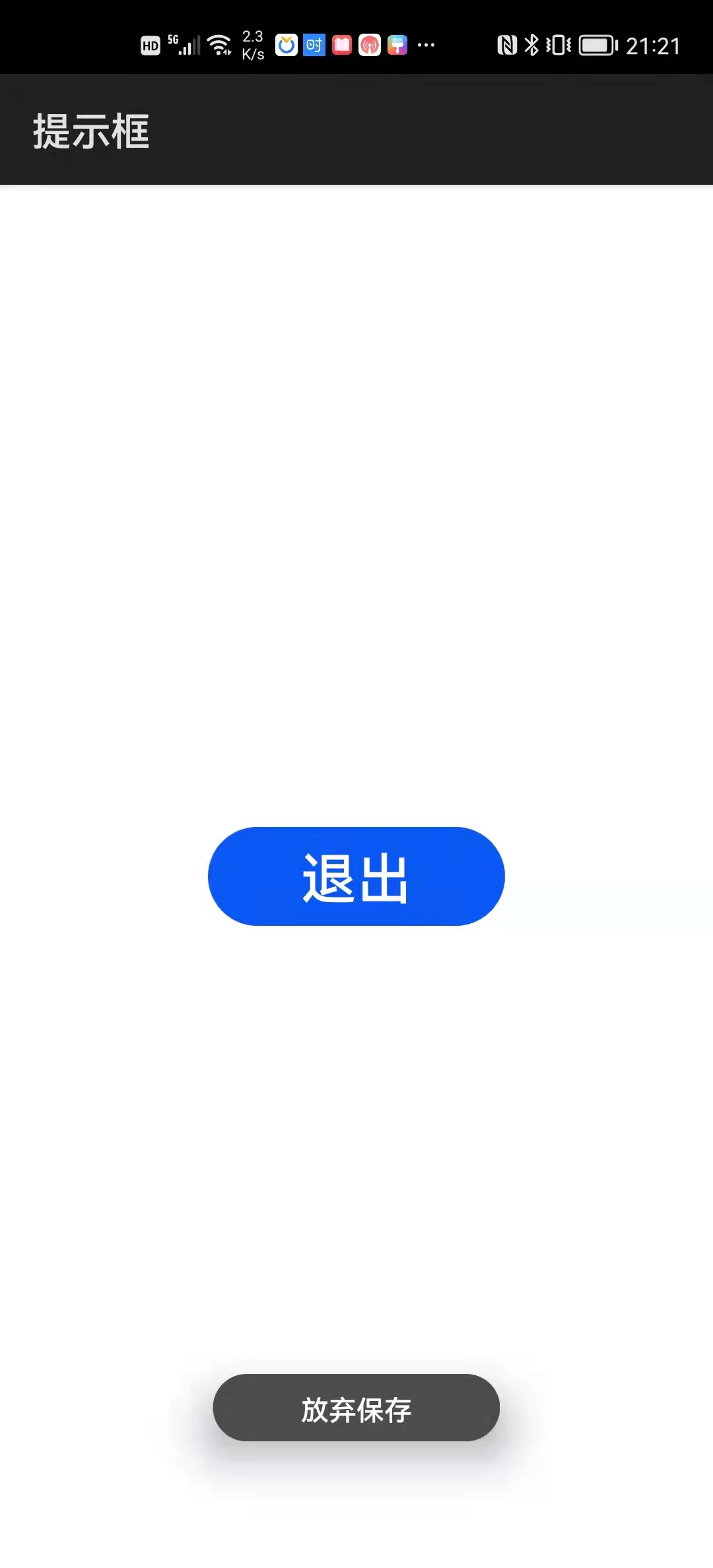
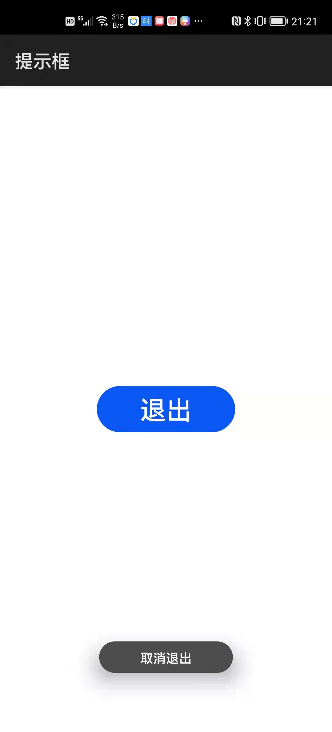
prompt.showToast ({
    message: "保存成功",
    duration: 3000});
例程:Prompt
...\Prompt\entry\src\main\js\default\pages\index\index.hml
<div class="div">
    <input class="btn" type="button" value="退出" @click="onClick" />
</div>
...\Prompt\entry\src\main\js\default\pages\index\index.css
.div {
    flex-direction: column;
    justify-content: center;
    align-items: center;
}

.btn {
    width: 150px;
    height: 50px;
    font-size: 28px;
}
...\Prompt\entry\src\main\js\default\pages\index\index.js
import prompt from "@system.prompt";
import router from "@system.router";

export default {
    onClick() {
        prompt.showDialog({
            title: "退出前是否保存文件?",
            message: "放弃保存,所有修改将被丢弃。",
            buttons: [
                {text: "保存", color: "#00a2e8"},
                {text: "放弃", color: "#ee1c24"}],
            success: this.onSuccess,
            cancel: this.onCancel});
    },
    onSuccess(data) {
        switch (data.index) {
            case 0:
                prompt.showToast({
                    message: "保存成功",
                    duration: 3000
                });
                setTimeout(router.back, 3000);
                break;

            case 1:
                prompt.showToast({
                    message: "放弃保存",
                    duration: 3000
                });
                setTimeout(router.back, 3000);
                break;
        }
    },
    onCancel() {
        prompt.showToast({
            message: "取消退出",
            duration: 3000
        });
    }
}
运行效果如下图所示: